

About Hobbiton Font
I came across Hobbiton Font while working on a small fantasy poster series for a personal project. I needed something loose and natural, but not too messy or childish. The font had that hand-painted feeling I wanted, with just enough structure to stay readable and calm.
What pulled me in was the way the strokes look like quick brush marks, yet the letters still hold a clear shape. I tested it in a few mock book covers for Free Fonts Lab, and it sat nicely with textured backgrounds and earthy colour palettes. It felt expressive without shouting for attention.
Font Style & Design Analysis
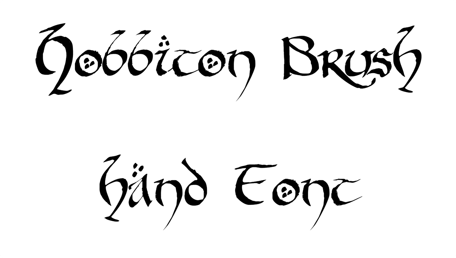
Hobbiton Font is a brush font, and it leans fully into that identity. Each stroke looks like it came from a slightly worn brush, giving the typeface a soft, organic edge. The lines are not perfectly straight, but they feel intentional. It carries a rustic fantasy mood, almost like writing on an old map.
The designer is unknown, which can sometimes make context harder, but here the creative intent still feels clear. The font family seems focused on display use rather than long text. You sense a wish to blend storybook charm with a relaxed handmade look. Nothing feels overly stylised or forced.
The letterforms are wide and open, with rounded terminals and a gentle rhythm from word to word. Spacing is slightly loose, which helps each character breathe and keeps the brush texture visible. This brush category choice makes it strong for headlines and logos, but less suited for tiny captions. When pushed very small, the textured strokes can blur and lose clarity.
Where Can You Use Hobbiton Font?
I find Hobbiton Font works best in projects that tell a warm or magical story. Think fantasy book covers, game titles, craft packaging, or posters for themed events. At large sizes, the brush strokes become a key part of the visual identity and add character without extra illustration.
In medium sizes, such as subheadings or short quotes, it still holds up well, as long as the background is clean. For body text, I would avoid it and pair it with a calm serif or sans-serif typeface instead. A simple supporting font keeps the layout readable, while the brush style handles the expressive moments.
This typeface also works nicely for social media graphics, YouTube thumbnails, or banners aimed at younger or fantasy-loving audiences. When I tested it on darker backgrounds with light text, it carried a cinematic feel. On light backgrounds, it felt more like hand-lettered signage for a cosy shop or café.
Font License
The licence terms for Hobbiton Font can change depending on where you download it. Do not assume it is free for commercial work. Always check the official source for current personal and commercial use permissions before using it in paid client projects.
For me, Hobbiton Font is a reliable choice when I need gentle fantasy energy without going over the top, as long as I keep it for short, focused text.


Leave a Reply