

About Hobeaux Font
I first reached for Hobeaux Font while building a bold poster series for an art fair. The client wanted something loud, strange, and friendly at the same time. I needed a typeface that could shout from a distance but still feel playful and human, not cold or corporate.
That search led me back to this quirky display face. I had seen it before on packaging and gallery flyers, but never used it in a full system. This time, I tested it deeper for headlines, short tags, and wayfinding signs, then documented my notes for Free Fonts Lab so other designers can judge if it suits their work.
Font Style & Design Analysis
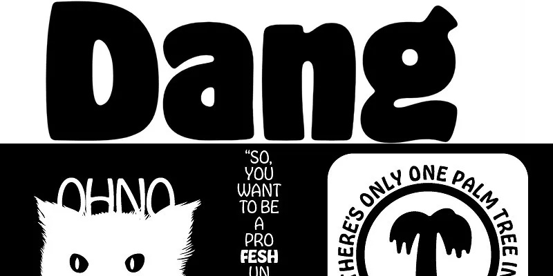
Hobeaux Font is a pure display font, and it acts like it knows it. The shapes are chunky, tall, and almost cartoonish, with strong vertical energy. It feels like wood type that has been redrawn for a digital age, keeping the oddities and turning them into a clear design statement.
The font family comes from the mind of designer James Edmondson and the foundry OH no Type Company. That history matters, because his work often plays with nostalgia and humour in typography. You can feel that same attitude here, mixing vintage poster energy with a more modern, graphic twist.
The letterforms are wide and heavy, with tight spacing that packs lines together like blocks. Curves are soft but exaggerated, which gives the font style a loud, friendly voice. It sets a strong rhythm in big sizes, but in smaller text the details crush together and lose clarity. That is the main limitation: it works best when words stay short and have room to breathe.
Where Can You Use Hobeaux Font?
I see Hobeaux Font working best in posters, packaging, exhibition titles, and bold brand wordmarks. In large sizes, its display personality really comes alive, and every curve reads clearly. It can carry event graphics, youth brands, streetwear, and playful food products that want to feel loud and approachable.
On screens, it performs well for hero headlines, big banner text, and short UI labels that need strong impact. I would avoid using it for long paragraphs, menus, or detailed body copy. The heavy forms and tight spacing make reading slow at small sizes, especially on mobile, where fine counters close up quickly.
For pairing, I usually match this typeface with a clean sans-serif or a light serif that can handle body text. The contrast keeps layouts balanced and lets the display shapes do the shouting. When you build a visual identity with it, keep colour and layout simple, or the whole design can feel overcrowded fast.
Font License
The licence for Hobeaux Font can change depending on where you get it and how you plan to use it. Always check the official source for details on personal, commercial, desktop, and web use. I strongly suggest reading the licence carefully before putting it into client work or large campaigns, just to stay safe.
My honest take as Ayan Farabi: this is a font I reach for when I want attitude, not subtlety. Used with care and space, it can give a project a bold, memorable voice.


Leave a Reply