
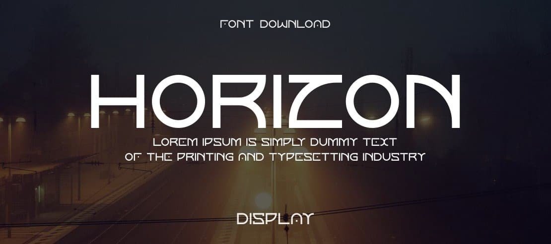

About Horizon Font
I first tried Horizon Font while working on a small sci-fi poster set. I needed a clean, modern voice that still felt a bit bold and direct. Many options looked either too playful or too cold, so I gave this one a careful test across a few layouts.
What kept me using it was the mix of clarity and presence. The shapes hold strong in simple grids and busy backgrounds. For Free Fonts Lab, I also checked how it behaves in longer text, UI labels, and quick mockups, just to see if it could handle more than headlines.
Font Style & Design Analysis
Horizon Font is a sans-serif typeface with a clear, forward look. The strokes feel even and steady, without much contrast. This gives the font family a simple, modern voice that fits tech, games, and clean branding. It leans more towards functional design than decorative flair, which helps it stay readable.
The creator is designer unknown, at least from the sources I could check. That means there is little official guidance on intended use or history. In cases like this, I rely more on visual testing and real layouts to judge trust, tone, and flexibility, instead of any brand story around the typeface.
The letterforms have straight lines, open counters, and modest curves. Spacing is on the tighter side, but not cramped, so text blocks stay neat. In sentence case, the rhythm feels even, with no letter standing out too much. It behaves like a practical tool: strong in headings, clear in menus, decent in short paragraphs. The main limitation is emotional range; it does not bring much warmth, so it suits rational, tech-forward, or neutral visual identity work. As a sans-serif, it keeps things clean but might feel a bit stiff in very friendly brands.
Where Can You Use Horizon Font?
I find Horizon Font most comfortable in display roles: titles, section headers, banners, and interface labels. At large sizes, the clean shapes hold up well, even on lower-quality screens. It works nicely on dark backgrounds, which makes it a good match for sci-fi posters, game covers, or tech-themed graphics.
In smaller sizes, it stays readable if you keep enough line spacing and avoid very light colours on bright backgrounds. I would not use it for long reading on print pages, but it can handle short product descriptions, captions, and short paragraphs on web or app layouts. It helps when you keep generous margins and a simple layout grid.
For pairing, I like setting Horizon Font as the main sans-serif display face and matching it with a softer serif for body text. The contrast brings a bit of human warmth while keeping the overall system modern. In brand work, I would use it for logos, navigation, and key messages, especially for tech, esports, and start-up audiences who expect a clear, strong, no-nonsense typography voice.
Font License
The licence details for Horizon Font can vary between sources, so I never assume anything. Always check the official download page to confirm if you may use it for personal, commercial, or client projects. When in doubt, treat it as restricted and look for clear licence text before publishing.
My personal takeaway as Ayan Farabi: this font works well when you need a clean, modern, and firm voice, as long as you accept its slightly cool, technical character.


Leave a Reply