

About Horseshoe Font
I came across Horseshoe Font while hunting for a bold title style for a poster series. I needed something with weight, charm, and a bit of drama, but not too wild or messy. The name caught my eye first, then the shapes kept me looking.
I decided to test it for a concept layout I was building for Free Fonts Lab. I wanted to see how this typeface behaved in real layouts, not just in a preview window. The strong outline and playful character suggested a loud voice, so I tried it in headlines, badges, and short taglines to see where it actually shines.
Font Style & Design Analysis
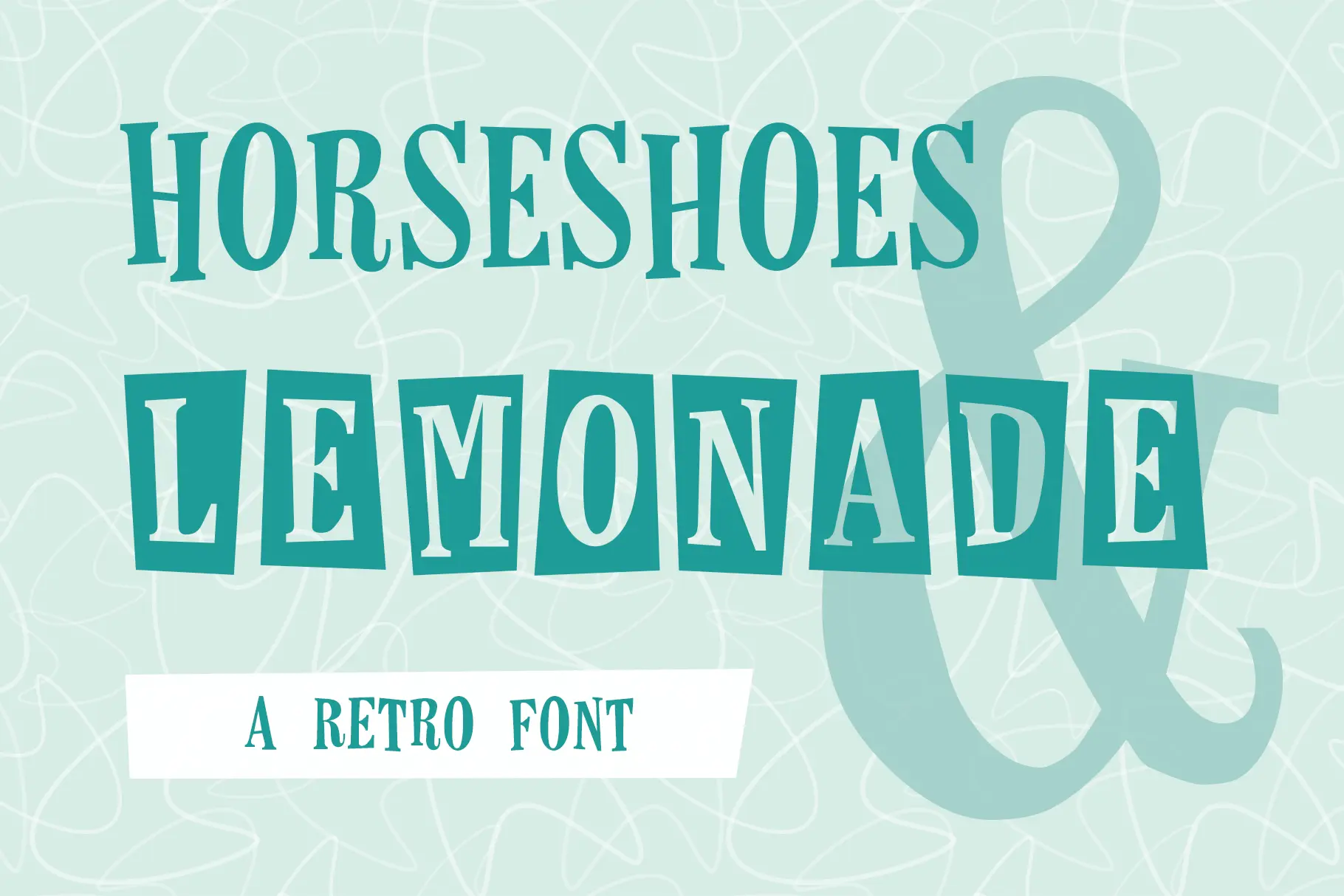
Horseshoe Font is a display typeface, and it makes that clear the moment you set a word. The letters feel chunky and confident, almost like they are cut from thick metal or carved wood. This is a font family built to grab attention, not to sit quietly in long text.
The designer is designer unknown, which always makes me look a bit closer at the decisions in the shapes. Here, the choices feel deliberate. The strokes are heavy, the curves are rounded, and the details lean into a playful Western or vintage fairground mood without turning into pure pastiche. It feels more like a modern nod than a strict revival.
The letterforms have wide bodies and tight internal spaces, which gives the typography a dense, compact rhythm. Spacing is on the snug side, so words feel solid and unified, especially in uppercase. This makes it great for strong logos or badges, but less ideal for small captions. The mood is bold, friendly, and a little theatrical, and as a display font style it works best when you keep words short and messages clear.
Where Can You Use Horseshoe Font?
I see Horseshoe Font working very well in posters, event graphics, and bold brand marks that need a playful edge. It suits food trucks, craft fairs, kids’ events, or casual sports teams. Anywhere that wants energy and warmth in its visual identity can probably use this typeface with good impact.
At large sizes, the heavy strokes and unique letterforms really shine. You can push it in headlines, packaging fronts, and large signage without losing clarity. At smaller sizes, the tight counters and weight start to merge, so I would avoid it for body text or detailed UI elements. It is simply not built for reading long passages.
For pairing, I like to match this display face with a clean sans-serif for body copy, so the loud style has room to breathe. A light or regular sans with open spacing keeps the layout balanced. Use Horseshoe Font for the punchy parts of your typography, then let a calmer companion handle paragraphs, menus, or supporting information.
Font License
The licence for Horseshoe Font can vary depending on where you get it, and terms may change over time. Always check the official source for clear details on personal and commercial use before you include it in client work or paid projects.
My honest takeaway as Ayan Farabi: this font works best when you let it speak loudly but briefly. Use it with intention, give it space, and it can add real character to the right project.


Leave a Reply