
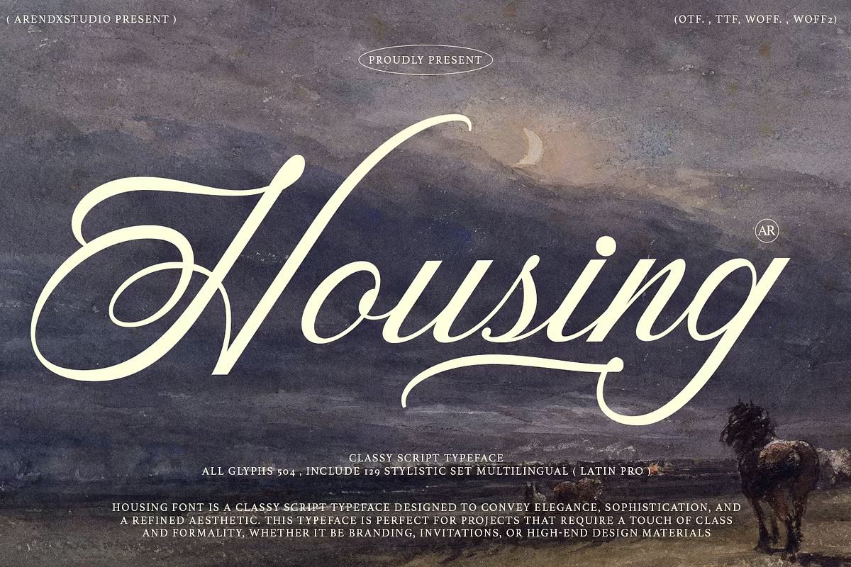

About Housing Font
I came across Housing Font while I was searching for a calm, flowing script for a wedding invitation set. Many calligraphy fonts felt either too fancy or too messy, but this one sat in a sweet middle ground. It looked warm, readable, and graceful without shouting for attention.
I decided to test it on a full print layout and some simple social posts. I wanted to see how it behaved with real names, dates, and short quotes. For Free Fonts Lab, I also checked how stable it felt across different weights and sizes. My aim was simple: would this typeface hold up in real projects, not just in pretty previews?
Font Style & Design Analysis
This typeface is a calligraphy font, and that defines its whole personality. The strokes feel written by hand, with smooth curves and gentle loops. It has a slight formal tone, but it stays friendly and modern. The overall font style leans more towards soft elegance than heavy decoration, which makes it easier to use.
The designer is unknown, at least from what I could trace while testing and documenting the font family. There is no strong branding around it, so the work speaks for itself. That can be a good thing if you want something that feels neutral in terms of fame, yet still has character in practice.
The letterforms have clear entry and exit strokes, but they avoid extreme flourishes. Spacing is fairly tight, giving words a connected rhythm, yet it does not collapse into a blur. In medium sizes, the strokes read well, and the mood stays romantic and calm. The main limitation appears in very small text, where details get lost and legibility drops.
Where Can You Use Housing Font?
Housing Font works best where emotion matters more than long reading. Think wedding stationery, save-the-date cards, personal branding, and boutique packaging. It suits audiences who appreciate crafted details and a gentle, human feel. Because it is a calligraphy design, it shines most when you give it room to breathe.
In large sizes, such as headlines, logos, or name marks, the curves look smooth and confident. The strokes feel consistent, so you can trust it on signage, covers, or main hero text. In small captions, though, I would avoid long sentences. It is better for short phrases than dense paragraphs when used at small point sizes.
I had good results pairing this typeface with a clean sans-serif for body text and information. Use Housing Font for names, short titles, or quotes, then support it with a neutral companion for details. It also fits simple social graphics, Pinterest-style pins, and announcement posts, where one strong line of text carries the whole visual identity.
Font License
Before using Housing Font in client work or commercial projects, always check the official licence details from the source. Terms for personal and commercial use can change, and different sites may list different rights. I never assume permissions until I read the current licence notes carefully.
For me, this typeface works best when I need soft, readable calligraphy that does not fight the layout. It has enough charm for special moments, yet stays practical when used with care.


Leave a Reply