

About Hulkamania Font
I came to the Hulkamania Font while working on a retro wrestling poster for a small event. The client wanted something loud, playful, and a bit over the top, but still readable from a distance. I needed a typeface that felt bold and full of energy without slipping into pure chaos.
As I tested options for Free Fonts Lab, this font stood out because of its wild comic-book feel and chunky shapes. It looked built for drama and nostalgia. I decided to try it in real layout tests, with big headlines, stacked words, and bright colour blocks, to see how the font style behaved in an actual design system.
Font Style & Design Analysis
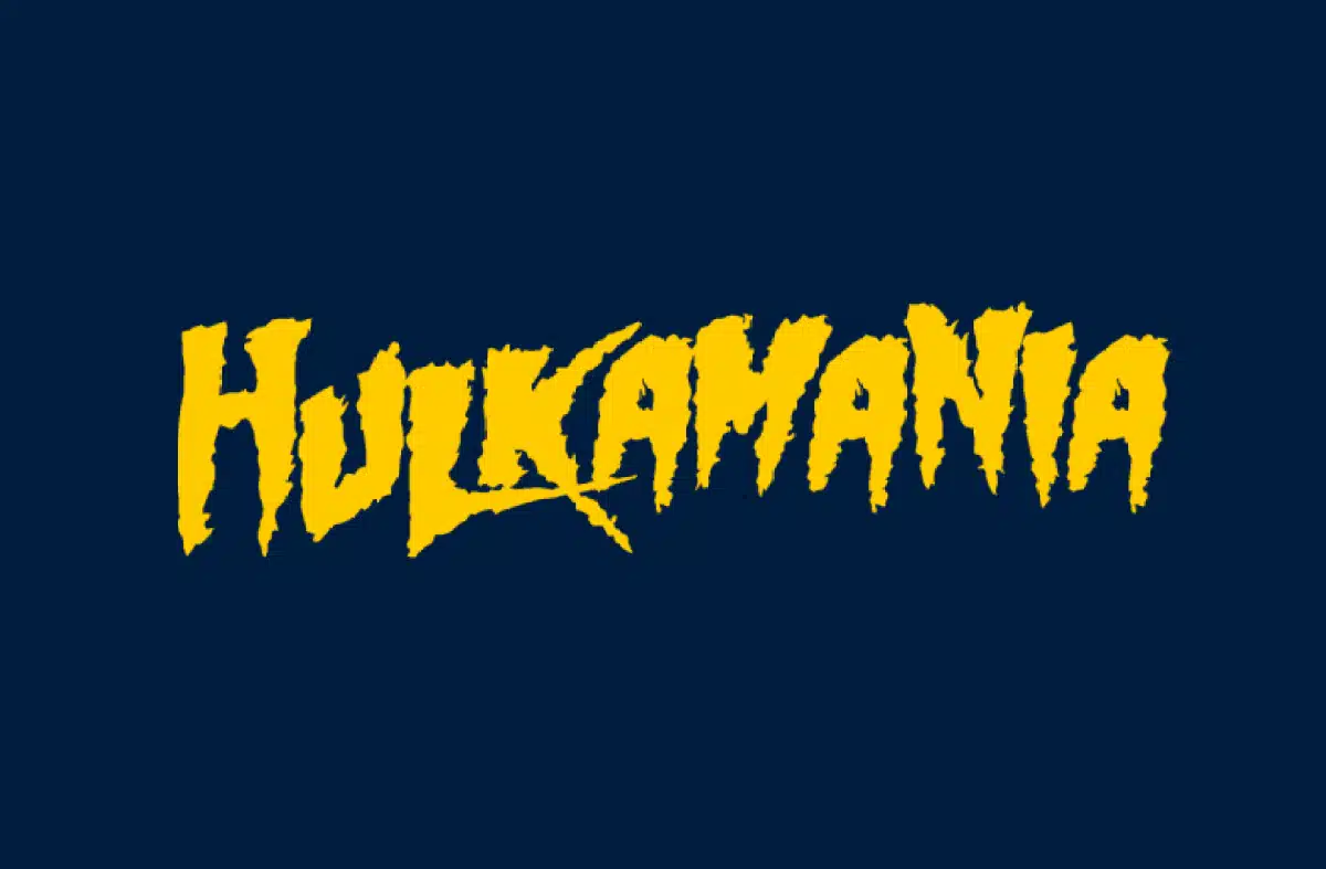
The Hulkamania Font is a pure display typeface, designed to grab attention first and ask questions later. The letterforms look rough, thick, and slightly irregular, which adds a hand-drawn, action-poster mood. It feels inspired by classic wrestling graphics and bold comic titles, with heavy strokes and strong shapes that demand space.
The designer is unknown, which is common for this kind of fan-style display font. Because the source is unclear, I treat it carefully when it comes to branding or commercial jobs. In my own work, I tested it mainly for explorations, mockups, and concept art, rather than as a final logo font family for serious clients.
The letters have tight counters and uneven edges that give the typography a raw punch, but they also reduce clarity at smaller sizes. Spacing feels compressed, so words form solid blocks of colour, which can be powerful for posters and banners. The rhythm is loud and restless, which works for hype-driven visuals, but it limits calm or minimal layouts. As a display font, its strength is headline impact, not subtlety or long reading.
Where Can You Use Hulkamania Font?
I found the Hulkamania Font most useful for big, dramatic headlines where you want instant impact. It works well on wrestling or sports posters, game titles, fun event flyers, and themed social media graphics. At large sizes, the rough letterforms become a strong visual identity element, almost like an illustration on their own.
In small sizes, the chunky shapes and tight spacing start to blur, so I would not use it for body text or long labels. It behaves best above 36pt, where each stroke has room to breathe. For supporting text, I usually pair it with a clean sans-serif font family to keep the layout balanced and readable while letting the display font shout from the top.
This typeface speaks well to younger audiences, gaming communities, wrestling fans, and any project that leans into humour or nostalgia. If you keep it to a few words per line, centred or stacked, it creates strong poster-style typography. Used in short bursts, with clear hierarchy and simple colour schemes, it can anchor a very bold graphic system.
Font License
The licensing for the Hulkamania Font can vary, and details are not always clearly stated. I never assume it is safe for commercial projects without checking. Before using it in paid work or for a brand, always review the licence from the original source and confirm what is allowed.
For me, this font is a fun, punchy option for concepts and bold experiments, as long as I respect its limits and treat it as a niche tool, not a universal solution.


Leave a Reply