

About Hyundai Font
I first looked at the Hyundai Font while working on a car-themed poster set. I needed a clean logo style that felt sharp, current, and easy to read from a distance. The wordmark for the brand already had a clear voice, so I wanted a similar mood without copying it directly.
That search led me to this logo-focused typeface. I tested it in mock car ads, app headers, and a few social banners for a concept project I later wrote about on Free Fonts Lab. It gave me a neat, steady structure that still felt modern and confident, which made me curious to explore it more closely.
Font Style & Design Analysis
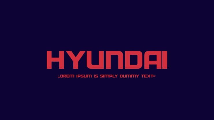
This typeface sits firmly in the logo category, and it shows that from the first word. The shapes feel engineered and deliberate, almost like parts of a car dashboard. Strokes stay mostly even, with gentle curves where needed, which creates a smart balance between technical and friendly.
As far as I can tell, the designer is unknown, which is common with many brand-inspired logo fonts. Still, the design choices seem very intentional. The spacing, proportions, and general rhythm suggest someone studied the original automotive branding language quite carefully before shaping this font family.
The letterforms use wide counters and slightly compact widths, which helps build a strong, stable visual identity. The spacing leans tight, so words lock together nicely in bold headlines and badges. It works best for short phrases, marks, and title typography. For long paragraphs, the density can feel a bit heavy, so I would keep it for display and logo work.
Where Can You Use Hyundai Font?
Because it is a logo style typeface, I treat the Hyundai Font as a tool for branding and display, not body text. It fits well in automotive concepts, tech brands, energy companies, or any project that needs a sleek, industrial tone. Short slogans, product names, and app icons benefit from its firm, geometric voice.
At large sizes, this font style shows its strength. The straight lines and simple curves stay crisp on screens and prints. You can push letter spacing slightly wider for outdoor ads, vehicle wraps, and shop signs. At very small sizes, though, the tight forms can close up, so I usually switch to a simpler companion typeface for captions.
In brand systems, I like pairing Hyundai Font with a neutral sans-serif for body copy. A calm, humanist sans keeps text readable while the logo font handles the bold moments: titles, wordmarks, navigation labels, and UI elements that need emphasis. Used this way, the Hyundai Font anchors the visual identity without overwhelming every part of the layout.
Font License
The licence terms for Hyundai Font can change depending on the source, so I never assume anything. If you plan personal, student, or commercial use, always check the official licence details first and make sure the permissions match your project.
For me, Hyundai Font is a focused, purposeful tool: great for bold, modern branding when used with restraint and the right supporting typefaces.


Leave a Reply