

About I Am Music Font
I came across I Am Music Font while exploring serif options for a moody poster series about jazz history. I needed a typeface that felt classic but not stiff, something that could hold emotion without turning into drama. The name caught my eye first, but the shapes kept my attention.
I decided to test it for title work and small pull quotes across a dark, textured layout. At Free Fonts Lab, I often try new serif fonts in real layouts before forming any opinion. This one felt promising enough to give it a serious trial in print and on screen.
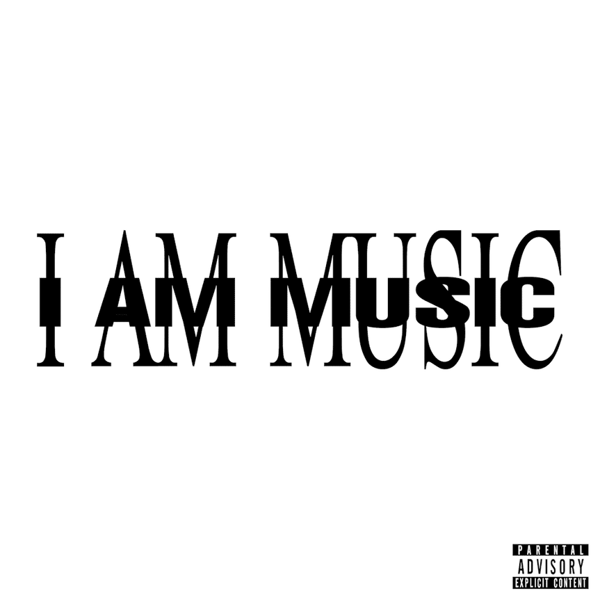
Font Style & Design Analysis
I Am Music Font is a serif typeface with a clear focus on expressive display work. The serifs are strong and slightly decorative, which gives the font style a bold stage presence. It does not try to be neutral. Instead, it leans into a dramatic, performance-like feel that fits its name quite well.
The designer is unknown, but the visual choices suggest someone with a strong interest in music branding and poster typography. The font family feels built for headlines, album covers, and event graphics rather than long reading text. Every detail seems tuned for impact over quiet utility, which is not a bad thing when you know that from the start.
The letterforms have high contrast between thick and thin strokes, with sharp terminals and slightly compressed proportions. This creates a tight rhythm that draws the eye but can look crowded at small sizes. Spacing is snug, and some pairs need manual kerning help in complex layouts. The mood is bold, dramatic, and a bit theatrical. It shines in large titles and short phrases, but it struggles in dense paragraphs or very small captions.
Where Can You Use I Am Music Font?
I found I Am Music Font works best in projects where you want emotion front and centre. Music posters, concert flyers, album covers, and theatre graphics are clear matches. In large sizes, the serif details look sharp and stylish, and the stroke contrast adds a nice sense of drama on both print and digital layouts.
At medium sizes, such as subheadings or short pull quotes, the serif character still reads well but needs careful spacing. I would avoid using this serif font for long body text, websites with dense paragraphs, or small UI elements. In those cases, pairing it with a calm sans-serif body font keeps the visual identity readable while letting the headlines stay expressive.
For branding, I see it fitting music labels, event brands, fashion projects, or lifestyle magazines that lean into bold typography. Used as a primary display typeface with a simple supporting family, it can create a strong, memorable voice. It just needs enough white space and clear hierarchy so the intense letterforms have room to breathe.
Font License
The licence for I Am Music Font may differ between personal and commercial use, and terms can change over time. I always recommend checking the current licence details from the official source before using it in client work, paid projects, or large-scale branding.
For me, I Am Music Font is a striking serif that works when I need emotional, music-driven headlines, as long as I respect its limits in small sizes and text-heavy layouts.


Leave a Reply