

About Imbue Font
I came across Imbue Font while searching for a strong title face for a book cover mockup. I needed something sharp, serious, and a bit dramatic, but still readable on both screen and print. The name caught my eye first, then the tall structure and crisp detail pulled me in.
I tested it on a series of dark, minimal layouts for Free Fonts Lab, mixing large headlines with small supporting text. Right away, I felt it had a clear voice: refined, confident, and slightly theatrical. It looked like it could handle editorial work, posters, and even some branding, so I decided to explore it more deeply.
Font Style & Design Analysis
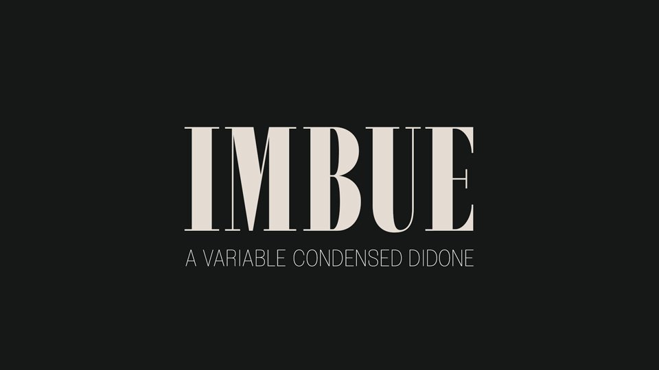
Imbue Font is a serif typeface with a strong vertical feel and high contrast between thick and thin strokes. The x-height is modest, the capitals are tall, and the whole font style leans towards a classic, bookish mood. It feels influenced by traditional editorial typography, but with a sharper, more modern edge.
From all the information I could find, the typeface comes from a digital font family with designer unknown. Even without a famous name attached, the work feels careful. The shapes show a clear sense of structure and intention. It does not look rushed or generic, which matters a lot when I judge any serif for serious design work.
The letterforms have fine hairlines, narrow proportions, and pointed serifs that almost act like small hooks. Spacing is tight but controlled, which gives headlines a strong rhythm and a compact, elegant block of text. At display sizes, the contrast looks beautiful and expressive. At smaller sizes, the thin parts can feel fragile, so I avoid using it as body copy. As a serif display face, its strength lies in titles, pull quotes, and short, impactful phrases rather than long reading passages.
Where Can You Use Imbue Font?
I find Imbue Font most at home in editorial-style layouts, such as magazine covers, chapter openers, or digital articles with strong visuals. At large sizes, the tall forms and delicate details give headlines a serious, literary tone. It works well for cultural projects, book-related content, or thoughtful opinion pieces that need a confident voice.
In branding, it can add drama to logos and wordmarks for fashion labels, perfume brands, or high-end events. It suits audiences who value refinement and a slightly formal visual identity. For balance, I often pair it with a clean sans-serif for body text, which helps maintain readability while letting the serif title carry the mood.
For posters, covers, and hero images on websites, the font family shines when you give it space to breathe. Large titles with generous margins and simple colour palettes feel especially strong. I avoid using it for small UI text, captions, or dense paragraphs, because the thin strokes can disappear on low-resolution screens. Used with care, it becomes a sharp, expressive accent rather than a general-purpose workhorse.
Font License
The licence terms for Imbue Font can change depending on where you download it from. Before using it in client work or commercial projects, always read the official licence details. I recommend checking both personal and commercial permissions carefully so the typography and the legal side stay safe.
For me, Imbue works best as a focused display tool: powerful in the right context, but not something I reach for in every project.


Leave a Reply