

About Instagram Sans Font
I first tested the Instagram Sans Font while working on a set of social media templates for a lifestyle brand. The client wanted something modern, clean, and close to the feel of the Instagram interface, without looking cold or too corporate. I was curious to see how this typeface behaved outside the app environment.
What drew me in was its balance of friendliness and order. It looks familiar at once, but it does not scream for attention. I decided to try it in headings, short quotes, and interface-style labels for a mock-up I later shared on Free Fonts Lab. That test gave me a clear sense of how this font family works in real layouts.
Font Style & Design Analysis
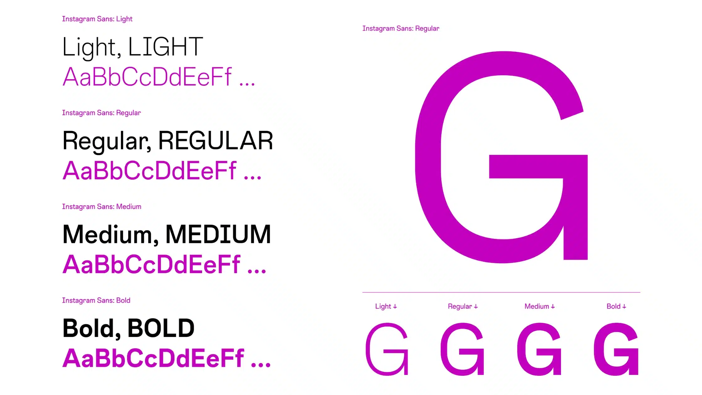
Instagram Sans Font is a sans-serif typeface with a soft, geometric base and gentle human touches. The shapes feel tidy and modern, but the curves have enough warmth to avoid a harsh, techy look. It feels designed for screens first, with clear forms that hold up well on bright backgrounds and coloured gradients.
As far as public information goes, the exact designer of this typeface is not clearly credited, so I treat it as designer unknown. Still, the design logic feels very intentional. The font style clearly aims to match the broader Instagram visual identity, sitting between friendly branding type and functional UI text.
The letterforms show simple structures, with open counters and even stroke weight. Spacing is fairly tight by default, which helps headlines look compact and strong. In long text, I often add a touch of tracking for more breathing room. The rhythm stays calm and steady, which suits captions, labels, and short paragraphs. Its main strength is clarity at medium sizes; at tiny sizes, the rounded details can blur a bit, so I keep body text limited. As a sans-serif option, it works best when you do not need extreme character or heavy contrast.
Where Can You Use Instagram Sans Font?
I find Instagram Sans Font most useful in digital work where a social, approachable tone is needed. It feels natural in social media graphics, app mock-ups, presentation slides, and lightweight web interfaces. At larger sizes, such as story covers, profile banners, or hero headlines, the curves look smooth and confident.
At smaller sizes, like captions or navigation labels, it stays readable if you keep enough contrast and avoid very light weights. I usually test it across different screens to make sure the spacing works. For brand systems, it can support products aimed at younger or lifestyle audiences, especially where a relaxed, social feel is important.
In terms of pairing, I often match this font family with a more neutral serif for body copy, which adds contrast without fighting the main style. It also pairs well with simple geometric icons and rounded interface elements. If you lean into white space and tidy grids, Instagram Sans Font helps create a clean, connected visual identity that feels up to date.
Font License
The licensing for Instagram Sans Font can change, and usage terms are not always straightforward. Before using it in commercial branding, products, or client work, I always check the official source and any related documentation. For personal experiments or concept mock-ups, I still prefer to confirm what is allowed.
For me, this typeface works best when I want a modern, social-first look without heavy drama. Used with care, it can quietly support clear, friendly design.


Leave a Reply