

About Invincible Font
I came across Invincible Font while searching for a bold, cinematic look for a gaming logo project. I needed something loud, confident, and a bit dramatic, but still clean enough to work in different layouts. This font caught my eye because it felt strong without looking messy or overdone.
I tested it on mock logos, Twitch banners, and a few social media headers. The way the forms held together at large sizes made it easy to build a solid visual identity. For my review at Free Fonts Lab, I spent time checking how flexible it really is, not just how cool it looks in a single wordmark.
Font Style & Design Analysis
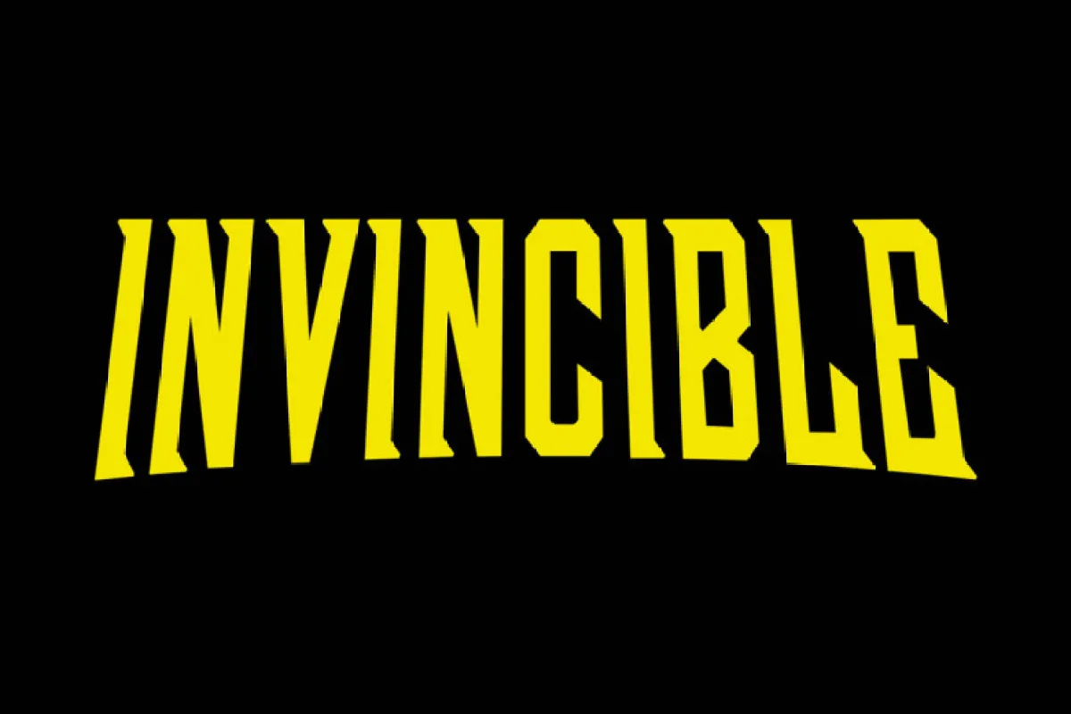
Invincible Font is a pure logo font, built for impact more than long reading. Its shapes feel sharp, heavy, and deliberate, with a strong sense of power. The font style leans towards bold display typography, which makes each word look like a title or emblem instead of simple text.
The designer is listed as designer unknown, at least from what I could confirm during testing. That lack of clear authorship makes me a bit careful about where I use it, but it does not take away from the visual qualities. As a working designer, I always double-check the source when the creator is unclear.
The letterforms are wide, blocky, and tightly built, which gives the font family a compact, muscular feel. Angled cuts and strong corners create a sense of motion, like something from action movie branding. Spacing is tight, so words form a single bold shape, great for logos but not for small text. It shines in short names, initials, and badges, but struggles when you push it into long lines or fine copy.
Where Can You Use Invincible Font?
I see Invincible Font working best in gaming logos, sports teams, esports branding, and action-themed posters. As a logo typeface, it carries the kind of presence you want in an emblem or crest. It suits audiences that enjoy bold, competitive, or heroic themes rather than soft or minimal brands.
At large sizes, the letterforms look strong and clean, with good edge clarity and rhythm. On screens, it holds up well in banners, thumbnails, and stream overlays. At smaller sizes, especially under a certain point size, details start to merge, and counters close in, so it loses legibility. I would avoid using it for UI labels, captions, or long taglines.
For pairing, I like combining Invincible Font with a simple sans-serif for body text, something neutral and calm. A light or regular weight sans keeps the layout readable while the logo font does the heavy lifting in titles. I also found that giving it generous spacing around the logo, plus minimal colour palettes, helps the typography breathe and feel more premium.
Font License
Before using Invincible Font in any paid or public project, you should carefully check the licence on its original source. Terms for personal and commercial use can change, and designer details are not always clear. I always verify permissions directly at the source to avoid legal or client issues.
My honest take as Ayan Farabi: Invincible Font is a strong choice when you need a bold, statement logo, as long as you respect its limits and confirm the licence.


Leave a Reply