

About Isabel Font
I came to Isabel Font while building a calm, book-like layout for a small cultural magazine. I needed a serif typeface that felt thoughtful but not old-fashioned. Many options looked either too formal or too decorative for long reading. Isabel sat somewhere in the middle, which made me curious.
So I downloaded it and tested it across headings, pull quotes, and short body text. I tried it in print mockups and simple web layouts for Free Fonts Lab. My goal was simple: see if this font family could stay readable while adding a subtle, modern character to the page.
Font Style & Design Analysis
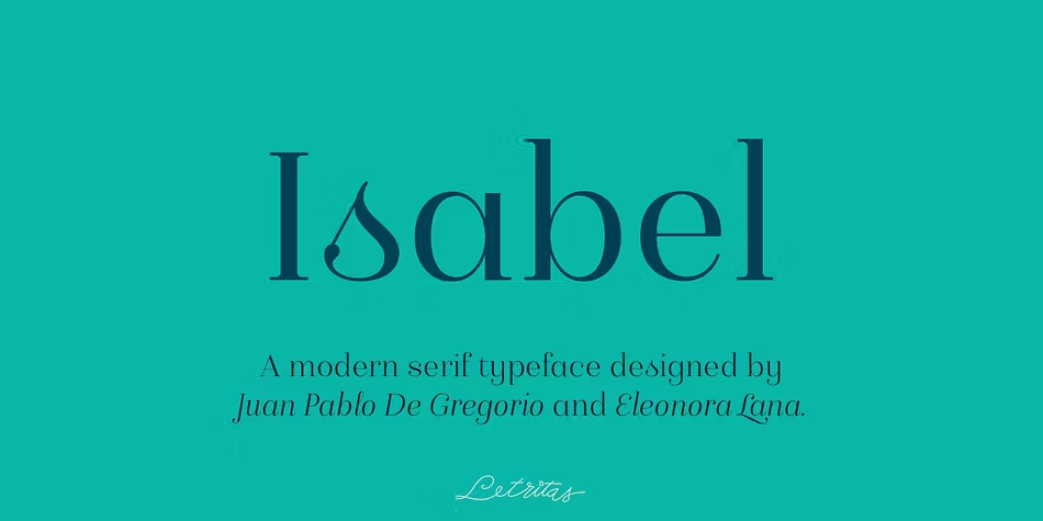
Isabel Font is a serif typeface with a clear, contemporary voice. The letters have firm, tidy serifs and a gentle contrast between thick and thin strokes. It feels cleaner than a classic book face, yet it still carries that trusted, literary mood you want from a serif. Visually, it balances softness with structure.
The serif design suggests a careful, detail-minded designer behind it, though the exact creator is designer unknown. From a user point of view, it feels like a thought-out font family rather than a quick project. The shapes look consistent across weights, and the style holds up well when mixed with simple sans-serif companions.
The letterforms are fairly open, with rounded counters that help legibility in small paragraphs. Spacing sits on the tighter side at display sizes, but it stays controlled, not cramped. The rhythm in text feels steady, which keeps reading calm and predictable. Its strengths lie in titles, subheadings, and short editorial copy. For very dense, tiny body text, the contrast and serif detail can start to feel a bit busy on low-resolution screens.
Where Can You Use Isabel Font?
I find Isabel Font most comfortable in editorial-style projects, like magazines, lookbooks, or cultural blogs. It also suits brand identities that want a thoughtful, bookish tone without looking stiff. In large sizes, the serif structure shows nice detail on posters, covers, and hero images, especially when the layout stays fairly minimal.
At medium sizes, it works well for subheadings, quotes, and short paragraphs on websites or printed brochures. The serif character gives a sense of trust and history, while the cleaner drawing keeps it modern. For long-form reading on screen, I usually bump the size slightly and add a bit more line spacing to keep the text airy and easy on the eyes.
For pairing, I like using this serif with a simple geometric or humanist sans-serif for body text. The contrast in font style helps define hierarchy without shouting. Avoid pairing it with another strong serif, as the page can feel crowded. For projects aimed at students, artists, or cultural institutions, the mood feels right: serious enough, but still approachable.
Font License
Before using Isabel Font in client work or commercial projects, always review its current licence terms from the official source. Some releases allow personal or test use only, while wider commercial use may need a paid licence. I always double-check licence details, even if I used the font before.
My honest takeaway as Ayan Farabi: Isabel is a solid serif choice when you want a calm, literary tone with a modern edge, as long as you handle size and spacing with some care.


Leave a Reply