

About Italianno Font
I came across Italianno Font while working on a wedding invitation set for a client who wanted something romantic, but still readable. I needed a script that felt graceful, yet not overly fancy or showy. Italianno stood out because it looked elegant, but also quite clean on screen.
I decided to test it more for Free Fonts Lab, because I was curious how it would behave in real layouts, not just pretty samples. The flowing strokes suggested warmth and movement, and I wanted to see if that charm held up in long names, dates, and small phrases across different formats.
Font Style & Design Analysis
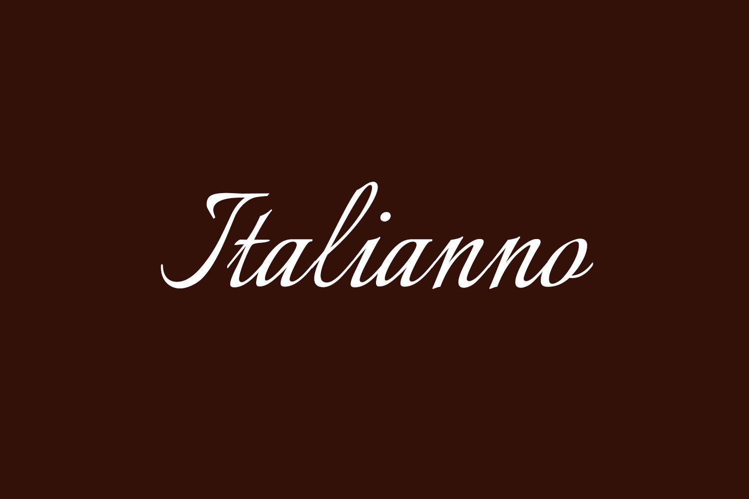
Italianno Font is a pure calligraphy typeface with a strong handwritten feel and graceful movement. The letters lean forward with a natural slant, which gives the text a sense of motion and rhythm. It feels like quick, confident pen work, rather than slow, decorative script.
The designer of this font is widely listed as Santiago Orozco, and it shows a clear understanding of classic calligraphic forms. The strokes feel deliberate and practised, not random. You can see a careful balance between flourish and clarity, which is important for any calligraphic font style used in real projects.
The letterforms are tall and narrow, with long entry and exit strokes that link words in smooth lines. Spacing is quite tight by default, which adds elegance but can create crowding in dense text. The rhythm is lively, almost musical, and it sets a romantic mood. As a calligraphy font family, it shines in short phrases and names, but it struggles with long blocks of copy or very small sizes, where the fine strokes start to blend.
Where Can You Use Italianno Font?
I find Italianno Font most effective in projects that need a sense of romance, ceremony, or personal touch. Wedding invitations, save-the-date cards, and place cards are clear fits. It also works well in beauty branding, perfume packaging, or boutique logos where a soft, human voice is important.
On larger sizes, like headings, logo marks, or quotes on posters, the stroke contrast looks elegant and the curves feel expressive. At these sizes, every loop and curve of the typography stays clear. In smaller text, especially under 12pt, the fine lines start to merge, so I avoid using it for body text, menus, or detailed instructions.
For pairing, I like to set Italianno as the accent typeface and match it with a simple sans-serif for body copy. A neutral geometric or humanist sans keeps the visual identity calm and modern, while the calligraphic script carries the emotional tone. Keeping enough white space around the script helps the letterforms breathe and prevents the layout from feeling busy.
Font License
From what I have seen, Italianno Font is often listed as free for personal use, and sometimes for broader projects, but licence terms can change. I always recommend checking the current licence details on the official source or distributor before using it in any commercial work or client project.
My personal takeaway as Ayan Farabi: Italianno works best as a graceful accent, not a workhorse font, and it can bring real charm when used with care.


Leave a Reply