
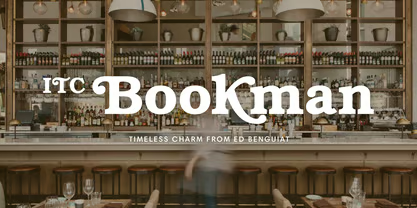

About Itc Bookman Font
I first picked up the Itc Bookman Font for a book cover redesign project that needed warmth and order at the same time. The client wanted something classic, but not stiff, and my usual serif choices felt either too formal or too plain for the story’s tone.
What drew me in was its friendly presence. The curves felt soft, yet the structure stayed clear and readable. As I tested different layouts for Free Fonts Lab mock-ups, I noticed how quickly it gave the pages a lived-in, literary feel without looking old or dusty.
Font Style & Design Analysis
This is a serif typeface with a very human, bookish voice. The overall font style leans towards traditional publishing, but there is a playful side in the curves and terminals. It looks like a serious reader that still enjoys a bit of charm, which makes it stand out from colder text faces.
The most well-known version of this font family comes from ITC (International Typeface Corporation), who gave the older Bookman style a fuller, more expressive update. Their take keeps the classic structure, but pushes the contrast, x-height, and details so it feels more open and generous on the page.
The letterforms are round, with wide counters and strong, clear serifs. Spacing feels relaxed, so text breathes well, especially in longer lines. The rhythm is steady, almost conversational, which adds a calm mood to reading. It handles emphasis and italics with style, but the bold weights can look heavy in tight spaces, so I use them with care.
Where Can You Use Itc Bookman Font?
I reach for Itc Bookman Font when I want a classic book feel without drifting into formal, academic territory. It shines in editorial layouts, novels, essays, and longer reading experiences where you need both comfort and character. For brands, it works well with calm, thoughtful, or heritage-driven visual identity systems.
In large sizes, like chapter titles or posters, the curves and serifs show real personality. You can push tracking slightly and it still holds together nicely. In small sizes, it stays readable, but I avoid very tiny captions, as the fuller shapes can start to blur on low-quality screens or prints.
I often pair it with a clean sans-serif for hierarchy, especially in interface elements, pull quotes, or navigation. A neutral grotesk or geometric sans beside this serif keeps layouts balanced and modern. For audiences, it speaks well to readers who value trust, warmth, and tradition, such as publishers, cultural projects, education, or thoughtful lifestyle brands.
Font License
Before you use Itc Bookman Font in any project, check the licence details from the official source. Desktop, web, and app use may each need different permissions. Do not assume free commercial use, even if you find a free download somewhere. I always verify the licence terms for every client job.
For me as a designer, this font sits in a sweet spot between literature and everyday reading. When a project needs a serif that feels human, trustworthy, and quietly expressive, I keep Itc Bookman close on my shortlist.


Leave a Reply