

About Jackson Font
I came across Jackson Font while searching for a relaxed yet stylish script for a small cafe rebrand. The owner wanted something friendly, not stiff, but still clear for menus and signage. The samples caught my eye because the strokes felt loose, like quick marker writing, but the shapes stayed readable.
I tested it first on menu headers and a simple logo lockup for Free Fonts Lab mock-ups. I wanted to see if this typeface could balance personality and function. It promised a casual mood without shouting for attention, which can be rare with script fonts. That quiet confidence is what made me dig deeper into this font family.
Font Style & Design Analysis
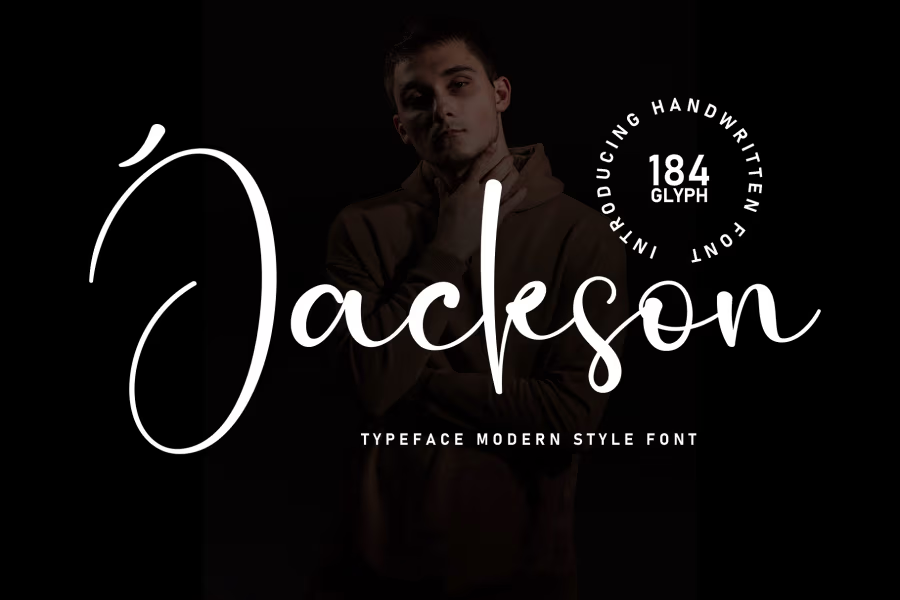
Jackson Font is a script font, and it leans towards an informal, marker-like handwriting style. The strokes look slightly rough and organic, as if written with a felt-tip pen on textured paper. It gives the typography a very human feel, relaxed but not messy. The baseline has a soft bounce, which keeps the rhythm lively without becoming childish.
The designer is unknown, at least from what I could see in the files and documentation I found. That does limit how much background story I can share about its origin or design concept. Still, the intent feels clear: a casual script that works in everyday design tasks, not just fancy invitation work or decorative lettering pieces.
The letterforms have open counters and fairly generous spacing, which helps legibility, especially in short phrases. The connections between letters are mostly smooth, though some combinations feel slightly tight, especially double letters and certain lowercase joins. The rhythm of the strokes creates a warm, friendly mood, great for branding, packaging, and headlines. Long paragraphs, however, feel tiring, so I would not use this script font for body text. It works best as an accent voice rather than the main reading typeface.
Where Can You Use Jackson Font?
In actual projects, I found Jackson Font very useful for branding that needs warmth and ease. Cafe logos, bakery packaging, handmade product labels, and lifestyle blog headers all suit this font style. It feels casual enough for creative brands, yet still controlled enough for small businesses that want a friendly face without looking chaotic.
At large sizes, like on posters, social media graphics, or shop signage, the script strokes really shine. The texture and rhythm of the handwriting become more visible and add character. At smaller sizes, such as on business cards or menu item labels, it stays readable if you keep line lengths short and avoid all caps. I usually pair it with a simple sans-serif for supporting text to create contrast and balance.
For layouts, I like using Jackson Font mainly for titles, taglines, and pull quotes. It works well when you give it space around, so the letterforms can breathe. It can speak nicely to younger audiences, craft-focused brands, and friendly local services. When used with a calm colour palette and clean grid, the script category quality feels refined rather than loud, which is where it performs best.
Font License
The licensing for Jackson Font can vary depending on where you obtain it, and terms may change over time. I always recommend checking the official source carefully for any personal, commercial, desktop, or web use. Before using it in client work, I make sure the licence clearly covers the specific project needs.
My simple takeaway as Ayan Farabi: Jackson Font is a charming, usable script that works well when you treat it as a headline accent and respect its casual, human rhythm.


Leave a Reply