

About Jacquard Font
I first tested Jacquard Font while working on a poster for a small metal gig. The band wanted something bold, dark, but still readable from a distance. I needed a typeface that felt historic and heavy, yet slightly playful, not too serious or grim.
As I browsed options for that brief, Jacquard caught my eye because of its textured, woven look. It felt like old fabric patterns turned into letters. I tried it in a few mockups for Free Fonts Lab, and it quickly proved more interesting than many standard display fonts I usually see.
Font Style & Design Analysis
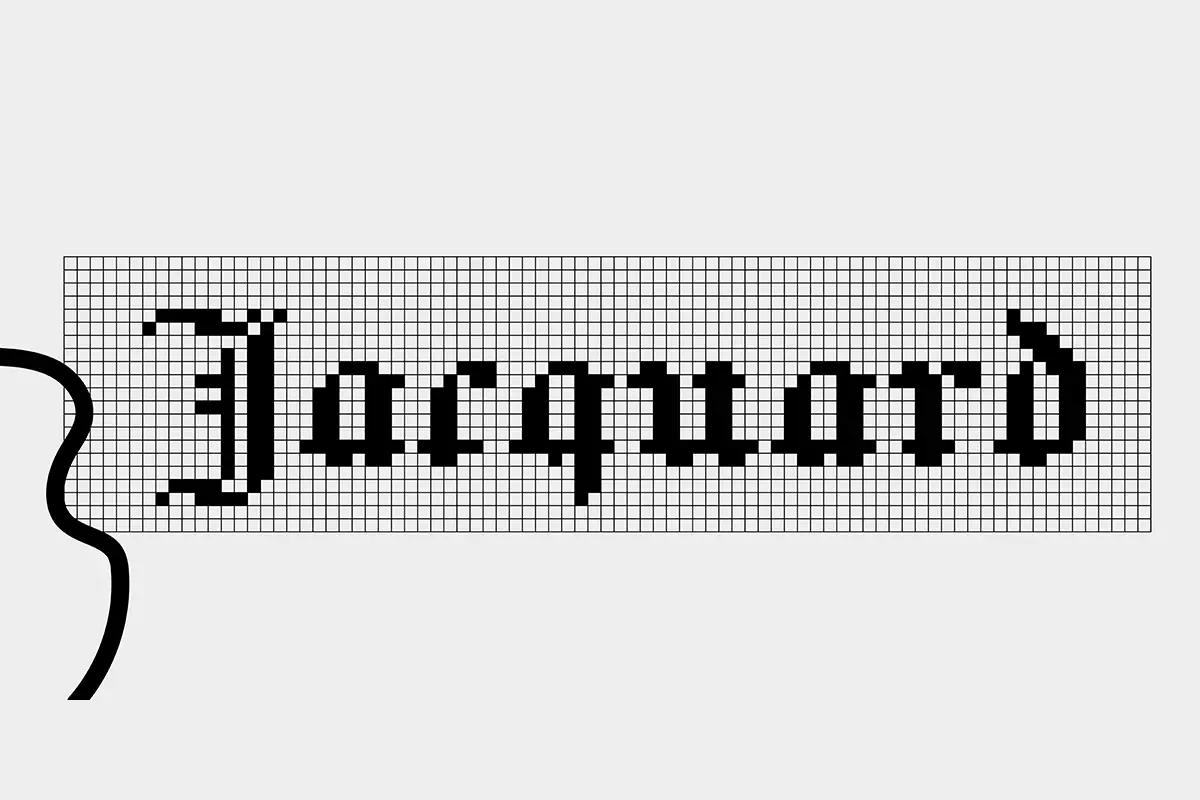
Jacquard Font is a blackletter typeface with a distinctive pixelated, tapestry-like effect. Each character looks like it has been stitched or woven, which gives the font a crafted feeling. The style mixes medieval energy with a digital grid, so it sits somewhere between gothic calligraphy and early bitmap lettering.
The designer is currently designer unknown, at least from the sources I could verify with confidence. Since the authorship is unclear, I treated it more carefully in client work and double-checked origin details before using it beyond concept stages. That extra step feels important when the creator is not clearly credited.
The letterforms are narrow and tall, with sharp angles and a clear vertical rhythm. The spacing is tight, so words form strong blocks of texture rather than airy lines of text. This suits headlines and logos, but not long reading. The blackletter structure adds drama, while the pixel feel softens it slightly. It works best in short, bold phrases where impact matters more than quick scanning.
Where Can You Use Jacquard Font?
In my tests, Jacquard Font performs strongest in large sizes, like posters, cover art, and title graphics. When you scale it up, the tapestry effect appears clearly and adds character to the layout. On stage backdrops or event flyers, it gives a unique edge that stands out from classic gothic fonts.
At smaller sizes, especially on mobile screens, the pixel texture starts to blend together. Words can look a bit noisy or crowded. For that reason, I avoid it for body text, menus, or UI labels. It works better as a hero heading, with a simpler sans-serif or serif font family used for supporting copy underneath.
I found it especially suitable for music graphics, gaming visuals, and themed posters, such as fantasy events or retro-tech projects. Pairing it with a clean geometric sans creates a nice balance between rough and smooth. You can also keep layouts very simple and let the typography be the main visual identity element.
Font License
Licensing for Jacquard Font can change depending on the source, so I never assume it is free for all use. Before using it in any commercial project, I always check the official licence terms carefully. For personal experiments, I still keep a note of where I downloaded it and any stated conditions.
My honest takeaway as Ayan Farabi: Jacquard is not an everyday workhorse, but when a project needs textured, gothic energy with a digital twist, it earns its place.


Leave a Reply