
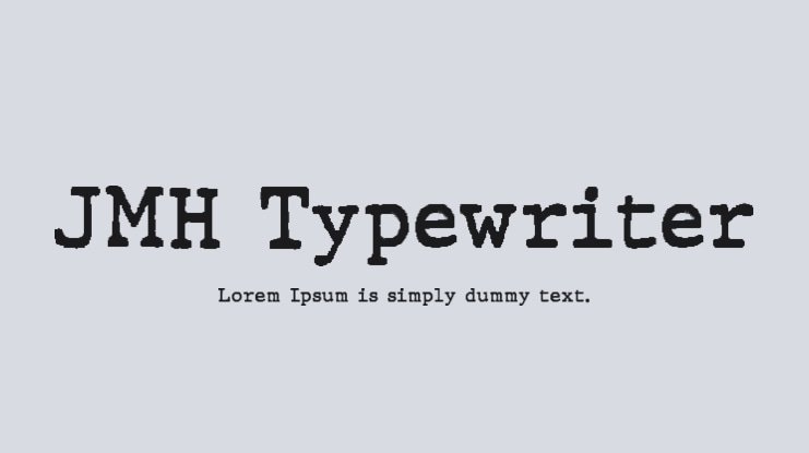

About Jmh Typewriter Font
I first tried the Jmh Typewriter Font while working on a small zine project that needed a rough, typed look. I wanted something that felt like an old page pulled from a writer’s desk, but still stayed readable in longer blocks of text.
The font instantly gave the layouts a more human, imperfect tone. It looked worn, but not fake or forced. I decided to explore it further for Free Fonts Lab, testing it in headings, body copy, and some simple poster work. That helped me see how far this typeface could really stretch in real projects.
Font Style & Design Analysis
The Jmh Typewriter Font is a serif typeface that mimics old mechanical typing without going into parody. The serifs are clear and a bit chunky, which gives each letter a sturdy, printed feel. It sits firmly in the serif category, but with a textured, machine-made character that hints at vintage documents and script pages.
The designer is unknown, but the intent feels clear when you look closely at the font family. Someone tried to capture the uneven pressure of a real typewriter, with slight roughness on some strokes and edges. It does not feel like a polished book serif; it feels like a tool made for raw notes, drafts, and creative documents.
The letterforms show small irregularities that add charm without breaking legibility. Spacing is a bit tight in some pairs, which suits short lines and narrow columns. The rhythm works well for medium-length text, but in very long blocks it can feel dense. As a serif typeface, it brings warmth and a touch of nostalgia, but it is less suited to clean, modern corporate typography.
Where Can You Use Jmh Typewriter Font?
I find the Jmh Typewriter Font works best in projects that need a personal or archival mood. Zines, diary-style layouts, creative writing samples, and literary posters all benefit from its worn, analogue voice. It helps you suggest memory, history, or process, rather than a final, polished result.
At larger sizes, the rough details in the letterforms become more visible and almost graphic. That makes it strong for headlines, pull quotes, or cover titles. At smaller sizes, the serif structure still holds together, but the texture can start to blur on low-resolution screens, so body text should stay a bit bigger than usual.
For pairings, I usually place this serif typewriter style next to a clean sans-serif for captions, UI elements, or supporting labels. That contrast keeps layouts readable while letting the typewriter voice lead the visual identity. It speaks well to audiences who enjoy vintage aesthetics, journaling, creative writing, and indie publishing.
Font License
The licensing for Jmh Typewriter Font can vary depending on where you download it. Some sources may allow personal use only, while others might include broader rights. Before using it in any commercial project, always check the current licence terms from the original source and keep a copy of the conditions.
My honest takeaway as Ayan Farabi: I reach for this font when I need something that feels like a real page from a working desk, not a sterile digital layout.


Leave a Reply