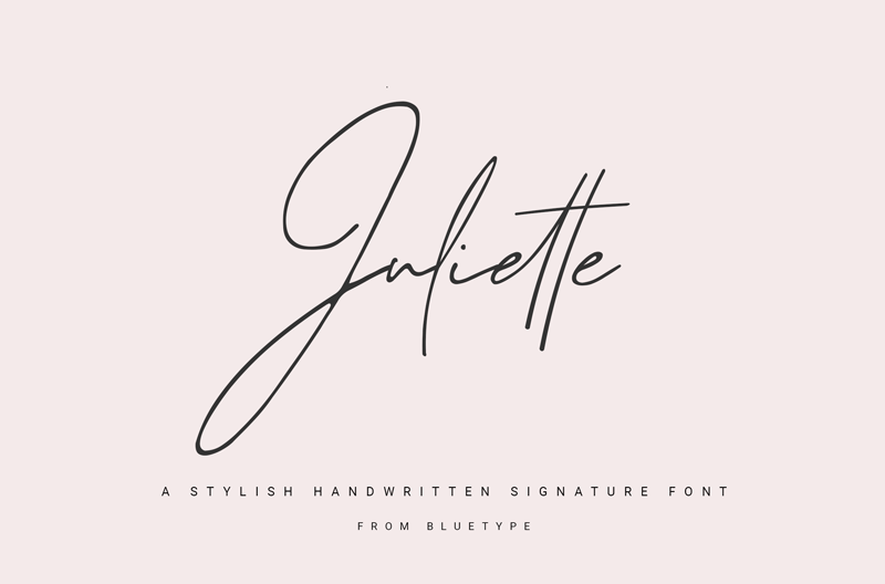
About Juliette Font
I was working on a soft, personal greeting card series when I tried Juliette Font for the first time. I needed a relaxed note, something that felt written by hand, but still tidy enough for print. My goal was a warm tone that did not look messy or childish.
The first thing that caught my eye was its gentle curves and easy flow. It looked like a neat journal entry, not a formal script. I tested it for headings, short quotes, and names, then wrote this review for Free Fonts Lab to see how it behaved in different layouts.
Font Style & Design Analysis
Juliette Font is a handwritten typeface with a calm, friendly voice. The strokes feel like they were made with a smooth pen, not a brush. Letters lean slightly, giving a light sense of movement, but the structure stays controlled. It feels casual, but not sloppy, which is a tricky balance for a handwritten font.
The designer is unknown, and that always makes me extra careful when I test a typeface. Without a clear foundry or author, I look more at rhythm, consistency, and basic technical quality. I also check how the font family behaves in different apps, because support can be uneven when the creator is not clearly credited.
The letterforms are rounded, with open counters and simple shapes. Spacing is on the loose side, which helps legibility at medium sizes, but can look too airy in long lines of text. The rhythm feels informal, like a personal note between friends. It shines in short phrases, names, and titles, but feels less strong in dense paragraphs or formal typography.
Where Can You Use Juliette Font?
I see Juliette Font working best in projects that need a soft personal touch. Things like greeting cards, thank-you notes, packaging for homemade products, or social media posts aimed at a friendly audience. At larger sizes, its handwritten character comes through nicely and the curves feel warm and approachable.
For smaller sizes, especially below 12pt, the relaxed spacing and informal shapes can start to feel a bit loose. I would not use it for body copy or long articles. Instead, I pair it with a clean sans-serif or a simple serif for paragraphs, and keep Juliette for headings, pull quotes, and short captions that guide the eye.
On branding projects, I would reach for this handwritten font when a client wants to feel approachable, home-made, or craft-focused. It suits lifestyle brands, stationery, kids-related products, and cosy café visuals. Used with lots of white space and simple layouts, it can give a gentle, human tone without overpowering the rest of the visual identity.
Font License
The licence for Juliette Font can vary depending on where you download it. Some sources might allow personal use only, while others may offer wider rights. I always recommend checking the official licence details carefully before any commercial project, and keeping a copy of the terms for future reference.
My honest takeaway: I reach for Juliette when I need handwriting that feels kind and readable, as long as I keep it for short, focused text elements.


Leave a Reply