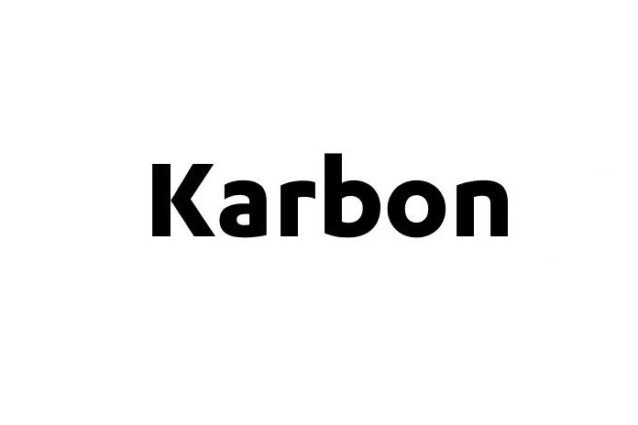
About Karbon Font
I first reached for Karbon Font while working on a clean interface for a data-heavy web app. I needed something calm, neutral, and easy to read for long periods. Many popular geometric typefaces felt a bit cold or too familiar. Karbon offered a softer, more human twist without losing structure.
Its simple forms and quiet character drew me in. I tested it across headings, labels, and dense tables to see how it behaved. For Free Fonts Lab, I also wanted to understand where this typeface shines and where it starts to struggle. My goal was to see if it could be a reliable, everyday workhorse in my projects.
Font Style & Design Analysis
Karbon Font is a sans-serif typeface with a clear geometric base and a gentle human touch. The shapes feel organised, yet not too rigid. Curves are smooth, strokes are even, and there is a steady rhythm across the font family. It gives a modern look, but without shouting for attention.
The designer of this typeface is not clearly credited, so I will treat it as designer unknown. That said, the design choices feel deliberate. The balance between geometry and warmth suggests careful testing in both print and screen settings. It does not feel like a quick clone of more famous geometric fonts.
The letterforms have open counters, especially in letters like a, e, and s, which helps breathing space in text. Spacing is fairly generous, so words do not clump together. This supports clarity at small sizes but can look a bit loose in huge headlines if not tracked carefully. The mood is calm, rational, and slightly friendly. Its strength lies in functional layouts; its limitation is that it may feel too quiet for very expressive branding. As a sans-serif option, it prioritises clarity over character.
Where Can You Use Karbon Font?
I found Karbon Font especially comfortable in digital products, dashboards, and clean corporate websites. In UI design, its even texture works well for menus, buttons, and form labels. At small sizes on screen, the open shapes and consistent strokes keep copy readable without visual noise. It supports clear information design.
At medium sizes, such as subheadings, quotes, and captions, the font style holds a steady, professional tone. It works nicely for annual reports, presentations, and minimalist brand guides. For brand identities, I see it fitting tech firms, startups, education platforms, and any organisation that wants a trustworthy, neutral visual identity.
In very large headlines, the simplicity can feel almost too restrained, so I often pair it with a stronger display face for contrast. A serif or expressive display font in titles, with Karbon handling body text, creates a balanced layout. Across all these uses, the Karbon Font family behaves predictably, which is what I want from a core sans-serif workhorse.
Font License
Licensing for Karbon Font can vary by source, version, and intended use. Please do not assume that personal or commercial rights are included by default. Always review the current licence terms from the official provider before using it in client work, apps, or large-scale branding projects.
My personal takeaway: Karbon is the kind of quiet typeface I reach for when I want the content, not the font, to lead the conversation.


Leave a Reply