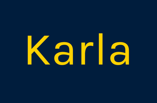
About Karla Font
I first tried Karla Font while working on a clean interface for a small web app. I needed a neutral voice that still felt human and friendly. Many popular sans fonts looked too sharp or too cold for that project, so I went searching for something softer.
What drew me to this typeface was its quiet confidence. The shapes felt simple, but not boring. I tested it in headings, body text, and small labels, just to see how far it could stretch. At Free Fonts Lab, I often look for fonts that stay calm in many layouts, and Karla quickly made me curious.
Font Style & Design Analysis
Karla Font is a sans-serif typeface with a clean, low‑drama look. The design leans towards a humanist style, so the letters feel open and easy to follow. It does not push itself forward like a loud display font. Instead, it sits back and lets the content lead.
The font family was designed by Jonathan Pinhorn, and you can see a careful, thoughtful hand behind the shapes. It looks like a typeface built for real, daily use rather than a one‑off show piece. The family structure gives enough styles for flexible typography without feeling bloated.
The letterforms have gentle curves, slightly quirky terminals, and good inner space, which helps with legibility on screens. Spacing feels even, with a steady rhythm that keeps long paragraphs readable. At large sizes, some details can look a bit plain, so it is not ideal for expressive display work. Where it shines is in clear content, UI text, and systems that need a quiet, stable mood from a sans-serif font.
Where Can You Use Karla Font?
I find Karla Font works best in digital products, dashboards, and content‑heavy websites. At small sizes, its open shapes and balanced spacing stay crisp, even on lower‑quality screens. Forms, buttons, navigation labels, and long text blocks all remain readable without drawing too much attention to the font itself.
In print, it suits brochures, simple brand guides, and modest visual identity systems that want a modern but relaxed tone. It pairs well with a strong serif typeface for headings, or with a bolder geometric font style for contrast. For brands that value clarity, warmth, and honesty, it can be a solid typographic base.
At larger sizes, like posters or hero headlines, it works when the design leans on colour, layout, or imagery rather than letter drama. If you need loud personality, this font family may feel too quiet. But for user‑centred design, editorial interfaces, and multilingual layouts, its calm voice and tidy structure make it easy to trust.
Font License
The licensing for Karla Font can vary depending on where you access the font family. Always check the official source for the most recent licence details. Make sure the terms cover your specific use, especially for commercial projects, app embedding, or large‑scale branding. I never skip that step, even for familiar typefaces.
My honest take as a designer: Karla is not a show‑off, but it is a reliable workhorse. When I need a quiet, modern companion that respects the content and the user, I keep it on my shortlist.


Leave a Reply