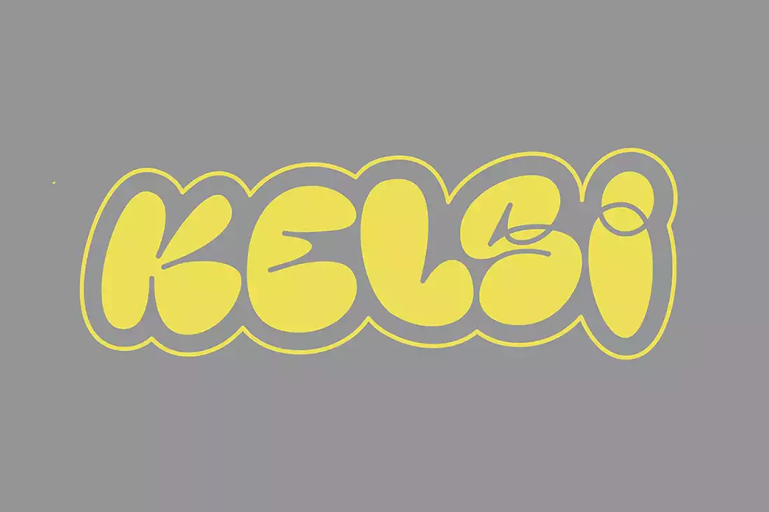
About Kelsi Font
I first picked up Kelsi Font while working on a concept poster that needed a bold, playful headline. The project called for something loud but still readable, and nothing in my usual library quite fit. Kelsi caught my eye with its quirky shapes and strong personality.
I decided to test it properly for a Free Fonts Lab review, not just drop it into one mock-up and move on. I used it across several layouts, including a social campaign, a hero banner, and a quick logo sketch. That gave me a clear sense of how this font behaves in real design work.
Font Style & Design Analysis
Kelsi Font is a display typeface with a chunky, attention-seeking voice. The letters feel compact and solid, with wide curves and tight counters that push the eye toward the centre of each shape. It looks made for big titles, not quiet body text, and it instantly sets a fun, informal tone.
The designer is unknown, at least from the source where I tested it, but the intent feels clear. This is a font built for posters, covers, and bold branding experiments. You can sense a playful approach to typography, where character and visual identity matter more than strict historic style or long-reading comfort.
The letterforms lean slightly rounded, with a soft blocky feel that avoids harsh edges. Spacing is fairly tight, which helps at large sizes but can start to crowd at smaller scales. The rhythm across the font family is consistent, so words look cohesive and unified. Its strengths lie in short, punchy phrases, while longer lines can feel heavy and dense, especially if tracking is not adjusted.
Where Can You Use Kelsi Font?
I see Kelsi Font working best in loud, visual-first projects where the headline carries the mood. Think music posters, event graphics, kids’ branding, or playful product packaging. At large sizes, the chunky display shapes hold together very well and create a strong focal point in the layout.
In smaller text, especially below medium subheading size, the tight counters and bold weight start to lose clarity. I would avoid using it for paragraphs or UI text. Instead, I pair it with a clean sans-serif or simple serif body font to keep the typography balanced. The contrast between a calm supporting typeface and this bold display style works nicely.
For social media graphics, banners, or thumbnails, Kelsi Font can grab attention quickly, especially with bright colour palettes and simple backgrounds. It suits audiences who enjoy a friendly, playful mood rather than a formal or luxury look. Used sparingly as a display accent, it can give a brand a memorable, upbeat voice without overwhelming the whole design system.
Font License
The licence terms for Kelsi Font can differ depending on where you download it. Some sources may allow personal use only, while others might include commercial rights. I always recommend reading the official licence text carefully before using it in client work or paid projects, and double-checking for any usage limits.
My honest takeaway: Kelsi Font is a fun display tool for bold headlines, as long as you respect its limits in small sizes and pair it with something calmer for text-heavy layouts.


Leave a Reply