
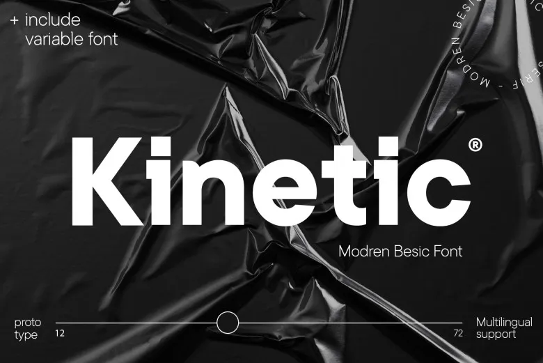

About Kinetic Font
I first tried Kinetic Font while working on a simple product landing page that needed a clean, modern voice. I wanted something clear but not cold, and most options I tested felt either too loud or too plain. This font caught my eye because it promised structure without feeling stiff.
I decided to use it for headings and short taglines to see how it behaved with real content. During testing for Free Fonts Lab, I pushed it in different weights and sizes, checking both web mockups and basic print layouts. That process showed me where it shines and where it needs a bit more care.
Font Style & Design Analysis
Kinetic Font is a sans-serif typeface with a calm, geometric look that still feels friendly. The shapes feel balanced, and the strokes keep a steady thickness across most letters. It sits in that space between strict tech style and humanist warmth, which makes it quite adaptable for many everyday projects.
The designer is listed as designer unknown, which sometimes makes it harder to trace the full design story behind the font family. Still, the intent feels clear when you look at the rhythm and structure. Someone aimed for a tidy, modern style that works both on screens and on basic printed pieces without visual noise.
The letterforms show clear construction, with open counters and decent spacing that help readability at medium sizes. Curves on letters like “o” and “e” feel smooth, while straight stems give the whole typography a steady backbone. At small sizes, spacing can feel a touch tight, so body text needs testing. Its main strengths are in headings, UI labels, and simple branding where a clean sans-serif voice fits.
Where Can You Use Kinetic Font?
I found Kinetic Font very comfortable in digital work, especially for product pages, dashboards, and light app interfaces. In large headings, the font style stays sharp and stable, even on lower resolution screens. Subheadings and short blurbs also read well, as long as you keep enough line spacing between lines of text.
For branding, it works best with modern, straight-talking visual identity systems. Tech companies, education platforms, and simple lifestyle brands can all use this typeface without it stealing too much attention. It pairs nicely with a soft serif or a neutral grotesque for body copy, creating a clear hierarchy between display and supporting text.
In print, I would use it for posters, flyers, and packaging where clear messaging matters more than heavy decoration. At very small sizes, like fine legal lines, I would be careful and test first, because the spacing can start to feel a little dense. When used with generous margins and clean grids, the Kinetic Font family helps layouts feel organised and steady.
Font License
Before using Kinetic Font in any paid or client project, it is important to review the official licence details from the source. Terms for personal and commercial use can change over time, so I always double-check the current licence text to stay safe and fair to the creator.
My honest takeaway: I reach for Kinetic Font when I need a clear, modern base that stays out of the way and lets the design thinking do the talking.


Leave a Reply