

About Kisser Font
I came across Kisser Font while searching for a bold brush style for a music poster. I needed something loose, loud, and human, but still readable from a distance. Many brush fonts felt either too messy or too clean, so this one caught my eye right away.
I decided to test it for a set of promo graphics and a social media campaign. The lively strokes and strong shapes made me curious about how it would behave in real layouts. I wanted to see if it could keep that energy without turning into visual noise. Later, I wrote this review for Free Fonts Lab after using it across a few projects.
Font Style & Design Analysis
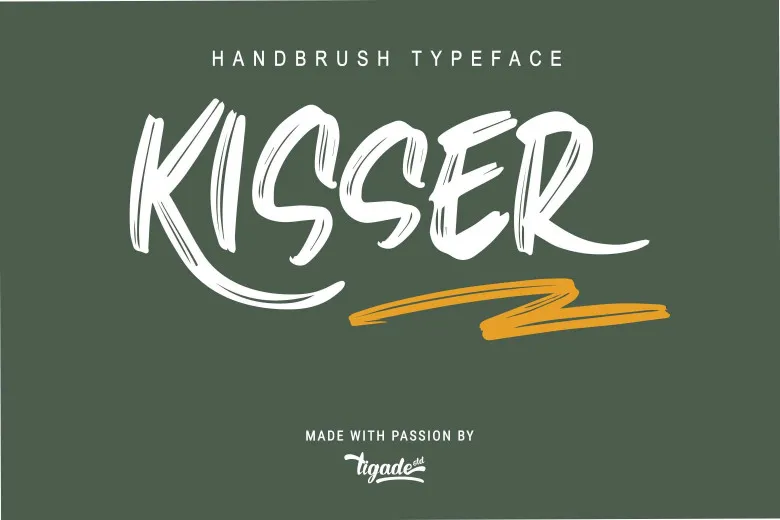
Kisser Font is a brush typeface with thick, confident strokes and a clear hand-drawn feel. The letters look like they were painted with a loaded marker or a rough brush pen. There is a nice mix of sharp angles and soft curves, which gives the font style a fast, energetic motion. It feels punchy, but not wild.
The designer is unknown, at least from what I could find through the usual sources. That said, the work shows a clear understanding of display typography. The shapes look considered instead of random. You can tell someone cared about balance between impact and control, even if the font family is not tied to a famous foundry name.
The letterforms lean slightly forward, which adds movement and attitude. Strokes taper at the ends, giving a natural brush finish without too much texture noise. Spacing is tight, especially in uppercase, so words form strong blocks. This helps for posters and headers, but it can feel cramped in long lines. The rhythm works best in short phrases or titles. As a brush display font, it shines in bold statements, but it is not made for dense body text or tiny captions.
Where Can You Use Kisser Font?
I found Kisser Font most useful in loud, expressive projects. It works well for music covers, event posters, streetwear branding, and social media graphics. At large sizes, the brush character really comes through and adds personality to the visual identity. It speaks to younger, creative audiences who like bold, crafted looks.
In medium sizes, such as flyer headings, thumbnails, or pack titles, it still holds its shape nicely. The strokes stay clear, and the letters remain legible if you give them enough spacing. I avoid using it for long taglines or menus, because the heavy style can feel tiring when repeated too much on a single page.
At small sizes, the thick strokes start to merge, and details disappear. For that reason, I pair Kisser Font with a clean sans-serif for body text or supporting copy. Using it only for key words, logos, or short headlines keeps the layout balanced. When used with generous margins and simple backgrounds, it adds strong energy without overwhelming the design.
Font License
The licence for Kisser Font can change depending on where you download it from. You should always check the official source for clear terms before using it in client work or products for sale. For personal or commercial use, I recommend reading the licence details carefully so there are no surprises later.
For me, Kisser Font is a fun, bold tool that works best in short, loud moments. When I respect its limits and support it with calmer fonts, it becomes a strong part of my design toolkit.


Leave a Reply