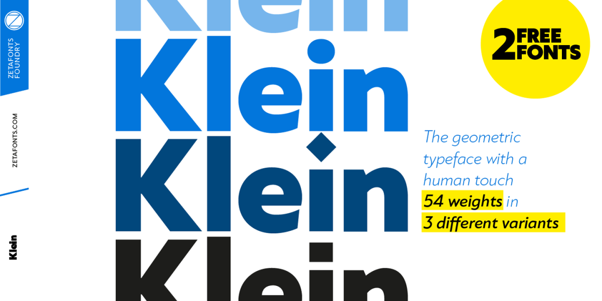
About Klein Font
I came to the Klein Font while building a clean interface for a small web app. I needed something modern, clear, and quiet, without looking cold or generic. This typeface kept showing up in my research, so I decided to give it a proper test inside my layout files.
During that project, I tried several neutral sans options side by side. Klein kept catching my eye for its balance of clarity and character. It felt familiar but not tired, which is harder to find than it sounds. I later revisited it for a case study at Free Fonts Lab, where I could explore it in more depth.
Font Style & Design Analysis
The Klein Font is a sans-serif font family with a very controlled, contemporary voice. Its shapes sit between strict geometry and human warmth, so it feels precise yet approachable. The strokes look even and calm, with no loud details. On screen, that gives the typography a steady, confident tone that works well for modern brands.
The official designer information for this typeface is not clearly stated, so I will treat it as designer unknown. From a design perspective, though, it reads like the work of someone who studied classic Swiss style and then softened it slightly. The system feels planned, not accidental, and each weight appears carefully tuned for consistent use.
When I look closely at the letterforms, I notice the open counters, the clean joins, and the modest terminals. Spacing feels generous enough for body text, especially in regular weights, but does not fall apart in tight headlines. The rhythm is even, which is great for interfaces, though some might find it a bit restrained for expressive display work. As a sans-serif, its main strength lies in clarity and structure, not decorative flair.
Where Can You Use Klein Font?
In my tests, the Klein Font worked best in digital products and brand systems that need a neutral backbone. It sits comfortably in dashboards, mobile apps, and web platforms where legibility is key. At larger sizes, the subtle details in the shapes give just enough personality for headlines without stealing attention from the content.
For small text, especially on screens, this font style holds up well. The open shapes and generous x-height help keep labels, menus, and captions readable. I would trust it for UI components, documentation, and clean editorial layouts. When I pair it with a serif for long reading, I like using Klein for headings and interface elements while the serif handles dense paragraphs.
In brand work, I see Klein fitting technology, education, lifestyle, and even light corporate identities that want to feel modern but not flashy. It can anchor logos that rely on simple wordmarks, though it may need custom tweaks for that. I would avoid it for very expressive, youth-driven campaigns that need loud display energy, but for calm, structured visual identity systems, it does a solid job.
Font License
Licensing for the Klein Font can change depending on the source and specific font family version. Always check the official licence terms before using it in client work or commercial projects. For personal tests or mock-ups, I still confirm the allowed scope, so I do not run into issues later.
My honest takeaway as Ayan Farabi: Klein is a reliable, quiet worker. When I need a clean, modern sans that supports the design instead of performing in front of it, I keep it in mind as a serious option.


Leave a Reply