

About Knitting Font
I came across Knitting Font while searching for a cosy, handmade look for a winter gift guide layout. I needed something that felt friendly and personal, but not childish or messy. The font caught my eye because it looked like quick notes from a sketchbook, which suited the project mood very well.
I decided to test it on headings, short quotes, and a few product tags. The relaxed stroke style gave the layouts a softer touch compared to clean geometric typefaces. It also filled the gap between neat handwriting and playful doodle fonts, which is rare. I later wrote up my experience for Free Fonts Lab so other designers could see where it shines.
Font Style & Design Analysis
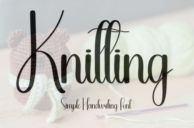
This is a handwritten typeface with a loose, casual rhythm that feels easy and unforced. The letters lean slightly, as if written in one calm sitting with a felt-tip pen. It sits between cute and mature, which makes it flexible. The font style keeps a clear structure, so it stays readable even when used in bolder colour themes.
The exact creator is not clearly credited, so for now I have to treat it as designer unknown. That lack of background does not change how it behaves in real work, but it does mean I stay extra careful with licensing and usage scope. Without a named foundry, I also rely more on my own testing instead of any official design notes.
The letterforms use rounded strokes and open counters, which keeps the handwriting look approachable. Spacing is slightly loose, which gives text room to breathe but can look airy in long lines. The rhythm feels informal, so it suits short phrases more than dense paragraphs. Its strengths sit in mood pieces, packaging, and warm headers, while detailed body copy and high-contrast editorial layouts expose its limits.
Where Can You Use Knitting Font?
In my tests, Knitting Font worked best in headings, logotypes for craft-themed brands, and short pull quotes. On posters, cards, and social posts, it brings a relaxed, homemade tone that fits lifestyle, DIY, and small café projects. It also supports seasonal campaigns, especially winter and cosy home themes, where a handwritten mood feels natural.
At large sizes, the handwritten details show nicely, and the slight wobble in the strokes adds charm rather than noise. On small labels or mobile screens, though, the lighter strokes can lose clarity, especially against busy photos. I generally avoid using it below medium subheading size, and I never set long paragraphs with it because reading comfort drops fast.
For layout pairing, I usually match Knitting Font with a clean sans-serif or a simple serif for body text. This lets the handwritten headlines carry personality while the supporting font family keeps structure and hierarchy. It suits audiences who appreciate personal, human touches: craft buyers, indie shop visitors, and younger users who enjoy diary-like typography in visuals.
Font License
The licensing terms for Knitting Font are not fully clear from the sources I found, so I treat it with care. Before using it in any commercial project, I strongly recommend checking the official distributor for current licence details and allowed usage. For client work, I always confirm rights in writing.
For me, Knitting Font is a charming tool for specific moments, not an everyday workhorse. When I need a gentle handwritten voice that feels honest and warm, it earns a place in my toolbox, as long as the project and licence both fit.


Leave a Reply