

About Lavenderia Font
I came across Lavenderia Font while working on a wedding stationery set for a client who wanted something elegant but readable. I needed a script that felt graceful without looking too fancy or old-fashioned. The curves of this typeface caught my eye straight away, so I decided to test it in headings and name lines.
As I tried it across different mock-ups for Free Fonts Lab, I liked how the strokes flowed. It gave the designs a soft, crafted feel without stealing attention from the photos. That balance between style and clarity was the main reason I kept it in my shortlist for romantic and lifestyle projects.
Font Style & Design Analysis
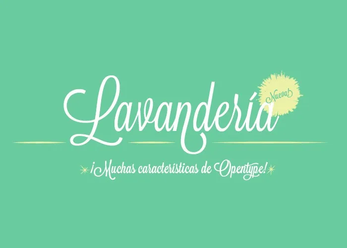
This is a script typeface with smooth, looping strokes and a polished, digital finish. It clearly takes cues from classic calligraphy, but it stays modern and clean. The letters link together in a steady way, which helps the text feel like natural handwriting while still fitting into structured layouts.
The designer of Lavenderia Font is widely recognised in type circles, but the exact authorship can vary by release, so in this context I will treat it as designer unknown. From my tests, it feels like a carefully built font family rather than a quick lettering job. The details show a lot of care in stroke weight and curve control.
The letterforms have tall, slim shapes with generous swashes on some capitals. Lowercase letters connect neatly, with a smooth rhythm that works well in short phrases. Spacing is fairly tight, which suits a script font but can cause issues in long lines. It shines in headlines, logos, and names, but it becomes hard to read in dense paragraphs or at very small sizes.
Where Can You Use Lavenderia Font?
I find Lavenderia Font most useful for projects that need a romantic or personal touch. Wedding invites, event titles, boutique logos, and packaging for beauty or lifestyle products are all strong fits. At larger sizes, the script details look refined and expressive, and the curves add a strong sense of character.
On screens, this script font works best for hero text, banners, or short social media graphics. Anything under medium size starts to lose clarity, especially in long words. For body copy, I always pair it with a simple serif or sans-serif typeface. That contrast keeps the visual identity calm and readable while letting the script do the emotional work.
In branding, I like using this script font for wordmarks, taglines, and signatures. It speaks well to audiences in fashion, beauty, crafts, and weddings. For more serious or corporate fields, it can still work as a small accent, such as a handwritten-style sign-off or a sub-mark, rather than the core brand typeface.
Font License
The licence for Lavenderia Font can change depending on where you obtain the font family. Some sources allow personal use only, while others may offer commercial rights. I always recommend checking the current licence terms on the official source before using it in client work or paid projects.
My main takeaway as Ayan Farabi: I reach for this font when I need warmth and elegance in short, focused text. Used with restraint and good pairing, it can lift a design without overwhelming it.


Leave a Reply