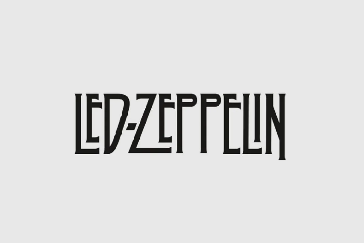
About Led Zepplin Font
I was working on a retro rock poster when I decided to try the Led Zepplin Font. I needed a bold logo font that felt loud, but still readable. The brief asked for something rooted in classic rock, without looking like a cheap copy of old band artwork.
While testing options for Free Fonts Lab, this typeface caught my eye for its sharp shapes and strong presence. I wanted to see if this font family could hold up in real layouts, across print and digital. It promised a heavy mood and strong identity, so I used it in a full poster and a mock album cover.
Font Style & Design Analysis
The Led Zepplin Font is a logo font at its core, built for impact rather than long reading. The design leans into bold, angular letterforms with a strong rock attitude. Strokes are thick, edges feel carved, and the whole font style pushes towards a dramatic, poster-ready look.
The designer is unknown, which is worth noting when you judge its history or reliability. Without a named foundry, I always take extra time to test spacing, outlines, and consistency. In this case, the work feels considered enough for headline use, but it still carries that slightly underground, fan-made energy.
Most characters show tall proportions, tight spacing, and strong vertical tension. The rhythm between letters feels compact, which helps logos and short titles feel solid and unified. Curves are minimal; even round letters keep a sharp, chiselled feel. This gives the typography a heavy mood, which suits rock themes but limits softer uses. It shines in short words, but starts to feel stiff in long lines or dense paragraphs.
Where Can You Use Led Zepplin Font?
The Led Zepplin Font works best in logo design, bold wordmarks, and short headline work. If you design band branding, festival graphics, or music event posters, it will sit comfortably at the centre of the visual identity. At large sizes, every edge and angle reads clearly and feels deliberate.
In smaller sizes, the tight spacing and blocky shapes can close up, especially on low-resolution screens. I would avoid using it for long captions or body text. Instead, I pair it with a simple sans-serif or serif typeface for supporting copy. That contrast keeps the logo font special and stops the layout from feeling heavy.
This logo-focused font family suits audiences who enjoy rock, metal, or vintage concert culture. It also works for themed merchandise, album mockups, or retro gaming titles that want a strong, gritty title style. When I use the Led Zepplin Font, I keep words short, adjust tracking slightly, and give the letters room to breathe in the layout.
Font License
The licence for the Led Zepplin Font can change depending on the source, so I never assume usage rights. Before using it in any client logo or commercial project, I always check the official licence details and look for clear terms on personal, commercial, and modification rights. That habit saves trouble later.
For me as Ayan Farabi, this font is a useful, niche tool: strong for bold logo moments, but only when the brief truly matches its rock-driven voice.


Leave a Reply