
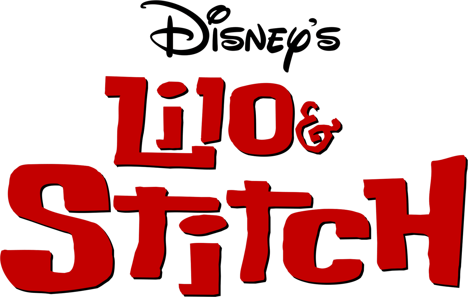

About Lilo And Stitch Font
I first tried the Lilo And Stitch Font while working on a playful kids’ poster. I needed something bold, friendly, and easy to read, but without feeling too serious or strict. This typeface caught my eye because it promised fun while still looking clean enough for real design work.
As I tested it in layouts for Free Fonts Lab, I liked how the shapes felt soft and approachable. It looked cartoon-inspired, but not messy or chaotic. I decided to explore it more and see where it could fit in branding, packaging, and simple digital graphics. That testing shaped the thoughts I am sharing here.
Font Style & Design Analysis
This is a sans-serif font family with a strong, rounded presence and a playful voice. The strokes feel thick and confident, with smooth edges that suggest warmth and movement. It clearly borrows energy from the Lilo & Stitch universe, yet it stays structured enough to work in real layouts, not just fan art.
The exact creator is unknown, so I must treat it as designer unknown. That lack of clear authorship sometimes makes me extra careful about where I use it, especially for paid client work. Still, as a study in character-driven typography, it offers interesting lessons in how shape and weight can express mood.
The letterforms are wide, with generous curves and almost bubble-like counters. Spacing is fairly tight, which helps headlines feel solid and compact, but can look crowded in long lines. The rhythm is bouncy rather than strict, giving a relaxed mood. Its strengths sit in display use; limitations appear when you push it into dense text or very small sizes. As a sans-serif, it stays readable, but this is a font for impact, not for paragraphs.
Where Can You Use Lilo And Stitch Font?
The Lilo And Stitch Font works best in projects that need a playful, family-friendly voice. I would reach for it in children’s event posters, birthday invitations, toy packaging, or themed party graphics. At large sizes, its bold curves and clear shapes stand out nicely and keep the message light and fun.
At medium sizes, such as headings in a brochure or a simple web banner, the font style still holds up well. It keeps its charm without becoming noisy. For layout work, I often pair it with a neutral geometric sans-serif for body copy, so the eye can rest while the main title carries the personality.
At very small sizes, such as tiny captions or long app text, I would avoid using this font. The tight spacing and chunky strokes can feel heavy and cramped. For brands or creators working in entertainment, kids’ content, or casual social media graphics, though, the Lilo And Stitch Font can add a strong, cohesive visual identity when used as a hero display typeface.
Font License
Before you use this font in any project, especially for a client or commercial work, check the licence from the original source. Some versions may allow only personal use, while others might need a paid or special licence. I always confirm terms first to avoid legal or ethical issues later.
After testing it in several playful layouts, I see this font as a fun, focused tool rather than a daily workhorse. Used with care and paired wisely, it can bring real charm to light-hearted projects.


Leave a Reply