

About Lordish Font
I came across Lordish Font while searching for a bold, medieval look for a poster series. I needed a typeface that felt strong and old, but not messy or hard to read. The name caught my eye first, then the dramatic shapes pulled me in.
I decided to test it on a fantasy event poster and a band logo mock-up for Free Fonts Lab. I wanted to see how it behaved with real headlines, stacked text, and simple layouts. My first tests showed promise, but also revealed where it needs some care and planning.
Font Style & Design Analysis
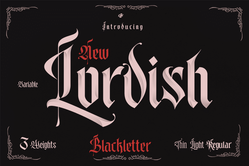
This is a pure blackletter font, and it leans into that style with full force. The strokes are sharp, tall, and narrow, with heavy contrast between thick and thin parts. It gives a strong medieval and gothic mood right away, which suits dark, dramatic themes.
The designer is unknown, at least from what I could confirm through my usual checks. That means there is no long design story or big foundry name behind it. For me, that put more focus on the actual drawing of the letters and how the font family behaves in layout.
The letterforms feel tight and compact, with many vertical strokes sitting close together. This creates a dense rhythm that looks powerful in short words, but can feel heavy in longer lines. Spacing is on the tighter side, so I often added a bit of tracking. The mood is intense and ceremonial, but it is not a good choice for running text or small captions. As a blackletter display font style, it shines in bold headlines and logos, yet loses clarity when pushed too small.
Where Can You Use Lordish Font?
I found Lordish Font most useful in large display settings. It works well on posters, event titles, metal or rock band graphics, and fantasy-themed artwork. At big sizes, the sharp edges and inner details become clear, and the strong vertical feel helps anchor a layout very quickly.
At medium sizes, like subheadings or menu titles, it can still work if the text is short. I would avoid using it for paragraphs, product descriptions, or UI text, because the dense strokes hurt readability. In my tests, pairing it with a clean sans-serif or simple serif body font gave a much better visual identity and balance.
For branding, I see it suiting game titles, medieval festivals, horror or gothic projects, and niche clothing labels. It speaks to audiences who enjoy dark, fantasy, or historic themes. I would keep word counts low and give the letters space around them. It prefers bold, simple layouts rather than busy compositions.
Font License
The licence for Lordish Font may differ between personal and commercial use, and it can change over time. I always suggest checking the current licence information from the original source before using it in client work, paid projects, or large print runs.
For me, Lordish Font is a strong tool when I need a heavy, medieval headline with real impact, as long as I handle size, spacing, and context with care.


Leave a Reply