

About Losta Masta Font
I came across Losta Masta Font while I was searching for a bold, characterful serif for a boutique skincare label. The client wanted something elegant but not too formal, with a touch of playfulness. Many options felt either too serious or too decorative for long brand use.
When I tested Losta Masta in the main logotype, it clicked quite quickly. The curves felt charming, and the contrast gave the wordmark a confident presence. I decided to explore it deeper for headlines, short taglines, and packaging details, then later wrote about it for Free Fonts Lab after a few weeks of real project use.
Font Style & Design Analysis
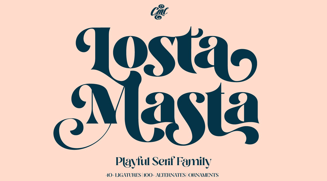
Losta Masta Font is a serif typeface that leans strongly toward display use. It mixes high contrast strokes with quirky details, especially in the bowls and terminals. The overall look feels both vintage and trendy, which makes it stand out on modern branding and editorial layouts.
The font family is released by Creative Media Lab, a foundry known for decorative and expressive display typefaces. Their work usually focuses on visual personality rather than strict neutrality, and Losta Masta follows that same direction. You can clearly see an emphasis on style and mood over strict functional minimalism.
The letterforms have wide curves, tight joins, and slightly compressed proportions, which create a strong rhythm at large sizes. The spacing works fine for short words, but long titles may need manual tracking adjustments. The mood is romantic, playful, and a bit dramatic. It shines in headlines, logos, and packaging, but it is not ideal for long body text because the serif details and contrast can feel heavy when set very small.
Where Can You Use Losta Masta Font?
I find Losta Masta Font most successful in brand marks, large headings, and short punchy phrases. Beauty, fashion, wedding, and lifestyle projects suit this serif font style very well. It brings a sense of crafted charm that works nicely for boutique products, artisan food, or vintage-inspired posters.
At large point sizes, the serif curves and high contrast look rich and expressive. The personality really comes through on packaging fronts, magazine covers, hero banners, and social media graphics. For smaller captions or navigation labels, I usually switch to a simpler sans-serif and keep Losta Masta only for emphasis and decorative words.
In terms of pairing, I like matching this serif with a clean geometric sans-serif for body copy. The calm structure of the supporting font balances Losta Masta’s flair. For layouts, I avoid using it in long paragraphs and instead treat it as a display accent. Used with restraint, it can shape a memorable visual identity without overwhelming the page.
Font License
The licensing for Losta Masta Font can differ between personal and commercial use, depending on where you obtain it. Some sources may allow personal projects for free, while brand or client work often needs a paid licence. I always recommend checking the official licence terms before using it in any professional project.
After using Losta Masta in real branding work, I see it as a strong, decorative serif best kept for headlines and identity pieces, not everyday text-heavy layouts.


Leave a Reply