
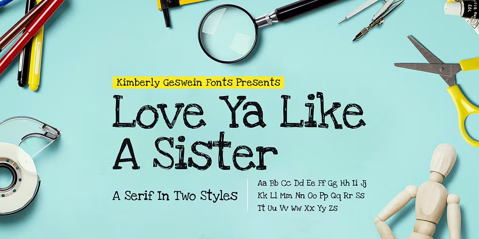

About Love Ya Like A Sister Font
I came across the Love Ya Like A Sister Font while searching for a playful title style for a children’s poster. The name caught my eye first, but the charm of the letters kept me there. It felt friendly, informal, and a little quirky in a good way.
I decided to test it on a set of fun quote graphics for social media at Free Fonts Lab. I wanted something that felt hand-drawn but still clear on screen. This font gave the designs a warm, personal tone without looking messy or rushed, which made me dig deeper into how it really behaves.
Font Style & Design Analysis
The Love Ya Like A Sister Font is a pure display typeface, built to grab attention rather than handle long reading. Its letters look like tidy marker writing, with rounded edges and playful shapes. Each word feels like a small illustration, which gives the font a strong, casual voice.
The designer is not clearly listed, so I have to treat it as designer unknown. Even so, the craft behind this font family is obvious. The strokes look considered, not random. It feels like someone spent time balancing fun and readability, rather than just tracing quick handwriting for effect.
The letterforms have a loose, bouncy rhythm, with slightly uneven heights and widths that add character. Spacing is fairly open, which helps at medium and large sizes. The mood sits somewhere between school notebook doodles and friendly signage. As a display font style, it works best for short phrases, not dense text. In very small sizes, some curves blur together, so it loses a bit of clarity.
Where Can You Use Love Ya Like A Sister Font?
I find the Love Ya Like A Sister Font most useful in projects that need warmth and play. It suits children’s posters, classroom materials, casual event flyers, and handmade-style branding. When I tested it on kids’ birthday invites, it immediately set a fun, approachable tone without needing extra graphics.
At large sizes, the typeface shows its personality clearly. Headlines, logotypes, and bold quotes work well because the rounded letterforms have room to breathe. At smaller sizes, like body text or long captions, the same looseness becomes harder to read. I would keep it for titles, tags, and short lines only.
For pairing, I usually match this display font with a simple sans-serif for body copy. A clean geometric or humanist sans keeps the layout balanced and readable. I avoid using another playful display font beside it, as the page starts to feel heavy and noisy. Used with restraint, it can anchor a visual identity that feels kind, youthful, and slightly nostalgic.
Font License
From my experience, licence terms for the Love Ya Like A Sister Font can vary by source and use case. Before using it in any personal or commercial project, I always check the current licence details from the official provider. That small step avoids confusion and keeps client work safe.
My honest take: I reach for this font when a project needs heart, not polish. Used thoughtfully, it delivers that feeling very well.


Leave a Reply