
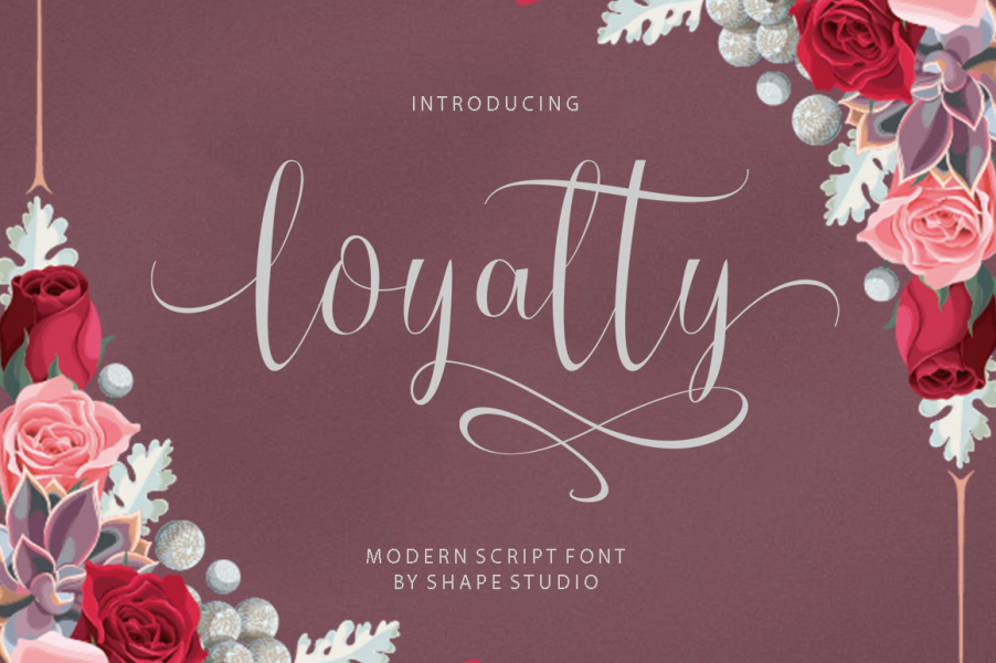

About Loyalty Font
I first reached for the Loyalty Font when a client asked for a warm, personal logo that still felt polished. I needed a script that looked friendly, but not messy or childish. Many options felt either too fancy or too rough, so I gave this one a careful try.
What kept me using it was the balance between flow and control. The strokes feel smooth, yet the words remain easy to read in short phrases. I tested it on mock logos, social media headers, and a simple packaging concept for a café brand for Free Fonts Lab. Each test showed me a slightly different side of its character.
Font Style & Design Analysis
This is a script typeface with a clear, connected handwriting feel. The letters link with gentle curves, and the baseline has a light, natural wave. It reads like careful pen work rather than fast casual writing. The weight sits in a comfortable medium range, so words feel confident without becoming heavy or loud.
The designer is unknown, but the font family suggests a steady understanding of everyday branding needs. Nothing about the design screams for attention; instead, it supports the message. The style feels flexible enough for both modern and slightly vintage moods, depending on colour and layout choices.
The letterforms use rounded loops, simple terminals, and clear counters, which keeps legibility decent for a script style. Spacing is on the tighter side, so I often increase tracking a little for logos and headings. The rhythm works best in short words and phrases. Long text blocks start to feel busy, so I treat it as a display script for headlines, names, and tags.
Where Can You Use Loyalty Font?
I find Loyalty Font most useful in branding work where you want a friendly, approachable tone. Think coffee shops, bakeries, home-made products, beauty labels, or small lifestyle brands. It also fits well in quote graphics, name cards, and simple wordmarks that need a human touch without looking overly decorative.
On large sizes, such as posters or hero images, the curves and joins look smooth and pleasing. The shapes hold up well on screens and in print. At smaller sizes, like body text or tiny labels, the strokes begin to merge a bit, and legibility drops. I usually keep it for headings above 18–20 points and pair it with a clean sans-serif or serif for supporting text.
In layout work, it pairs nicely with neutral typefaces, as they let the script do the emotional work. I often use it for just one or two words in a line, then switch to a simpler font family for the rest. Used this way, Loyalty Font adds personality without overwhelming the visual identity or crowding the page.
Font License
The licence for Loyalty Font can change depending on where you get it and how you plan to use it. Always check the original source for clear terms on personal and commercial projects. I recommend reading the full licence each time before you include it in client work or large-scale designs. For me, it has become a helpful choice when I need a gentle, handwritten touch and have room to keep the words short and focused.


Leave a Reply