
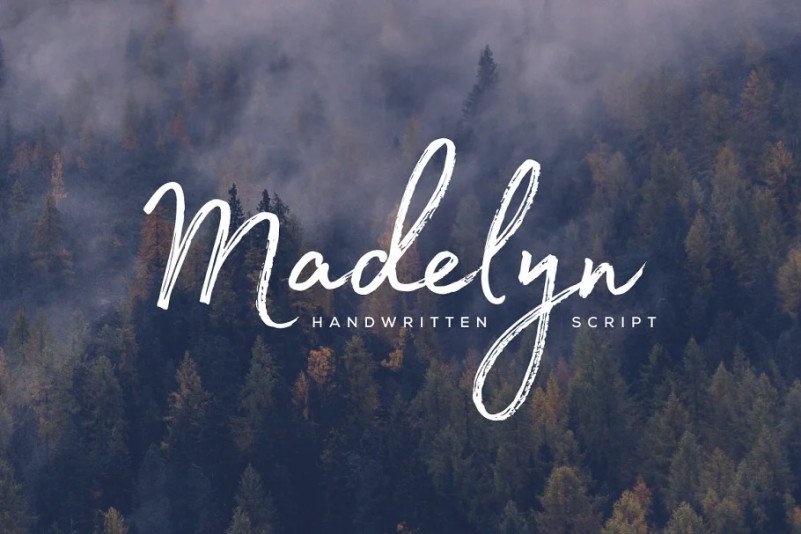

About Madelyn Font
I came across Madelyn Font while searching for a brush style script for a cosy café branding project. I needed something that felt hand-painted but still readable on menus and window graphics. The font looked warm, relaxed, and slightly playful, so I decided to give it a proper test.
I first tried it on a logotype sketch, then used it in some menu headings and social post mockups for Free Fonts Lab. The more I worked with it, the more I noticed its balance between casual strokes and controlled structure. It did not feel perfect for every layout, but it had a clear voice that stood out without shouting.
Font Style & Design Analysis
Madelyn Font is a brush font with a soft, natural flow that mimics quick, confident paint strokes. The overall typeface has a relaxed script feel, with strokes that taper at the ends and curve gently around corners. It leans slightly informal, but it still feels designed, not messy or wild.
The designer is designer unknown, which makes it harder to trace its full design story, but the craft suggests a clear stylistic direction. The font family seems focused on a single main style rather than many weights, which fits this kind of expressive brush design. It looks like it was built for display use rather than long reading text.
The letterforms show a strong contrast between thick downstrokes and lighter return strokes, which creates a nice rhythm in words. Spacing is fairly tight, so words feel connected and unified, but very long text lines can start to feel heavy. The typography mood is friendly, personal, and slightly romantic. It shines in short phrases, names, and titles, but it struggles if you try to use it for dense paragraphs or very formal layouts.
Where Can You Use Madelyn Font?
I found Madelyn Font works best in branding where you want a human, painted touch. It suits café logos, boutique shop signs, handmade product labels, and social media posts with a personal tone. At large sizes, the brush texture and curves stand out nicely and add character to simple layouts.
At medium sizes, like headings, quotes, or short taglines, the font style stays readable if you give it enough line spacing and breathing room. I would avoid using it in long body text or small captions, because the brush details can blur and the tight spacing can make words feel cramped. Pairing it with a clean sans-serif for body copy helps balance the visual identity.
For posters, invitations, and packaging aimed at creative, lifestyle, or craft-focused audiences, this brush font feels right at home. It also works well on digital banners if you keep the words short and clear. When I used it alongside a neutral geometric sans, the contrast in typography helped guide the eye and kept the design from feeling too busy.
Font License
The licence for Madelyn Font can change depending on where you download it. Some sources may allow free personal use but restrict commercial projects. I always recommend checking the official licence terms carefully before using it in client work or paid designs.
For me as Ayan Farabi, Madelyn Font is a brush script I reach for when I want warmth and hand-made charm, as long as I keep it for short, focused text.


Leave a Reply