

About Madoka Magica Font
I first reached for the Madoka Magica Font while building a playful logo set for a small anime-themed event. I needed something that felt magical but still clear enough for signs and badges. Its soft curves and dramatic details caught my eye right away and made me curious.
As I tested it, the font brought a strong fantasy mood without feeling too childish. That balance made me want to explore it more deeply for logo work and titles. I later wrote down my notes for other designers at Free Fonts Lab, because I knew many would ask about this typeface.
Font Style & Design Analysis
This typeface sits firmly in the logo category, and its design shows that from the first word you set. The letters feel theatrical, with decorative strokes and slightly exaggerated shapes. It leans into a magical girl anime tone, mixing whimsy with a touch of drama. The overall font style looks built for impact, not long reading.
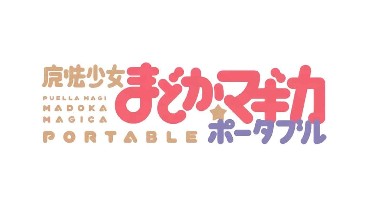
As far as I can tell, the designer unknown detail still stands, which makes it harder to trace its full design story. Even so, the font family clearly borrows from the energy of the Puella Magi Madoka Magica visual identity. It mirrors that universe through bold shapes and stylised curves rather than direct copying.
The letterforms have wide bowls, tight joins, and some quirky angles, which give a sense of movement. Spacing runs on the tighter side, so words feel compact and solid. That helps headlines, but hurts readability in smaller sizes. The rhythm suits short titles, logos, and wordmarks, yet feels heavy for running text. Its main strengths are mood and personality; its limits appear when you try subtle or minimal layouts.
Where Can You Use Madoka Magica Font?
The Madoka Magica Font works best as a logo and headline typeface, not as body text. I found it very effective for anime events, fan projects, streaming overlays, and themed posters. It speaks well to younger audiences, cosplay groups, and anyone who enjoys fantasy or magical girl stories.
At large sizes, the typography really shines. Each stroke and curve becomes part of the visual identity, which helps build a strong title or banner. At smaller sizes, especially under 14pt, details start to blur and counters close up. For that reason, I pair it with a clean sans-serif or simple serif for body copy to keep layouts readable.
In branding work, I use this typeface as a hero accent, never as the only font family. It can anchor a logo, section headings, or key callouts, while a calmer companion font handles long text. If you keep the colour palette simple and allow generous spacing around the wordmark, the Madoka Magica Font can add a clear, focused sense of magic without overwhelming the page.
Font License
Before using the Madoka Magica Font in any client or commercial project, always check the original licence terms from the source. Some versions allow personal use only, and rules can change over time. I always confirm usage rights and keep a copy of the licence text for each project folder.
For me, this font is a fun, expressive choice when I need a magical anime mood in logos and titles, as long as I keep it large, focused, and well-supported by a simpler companion typeface.


Leave a Reply