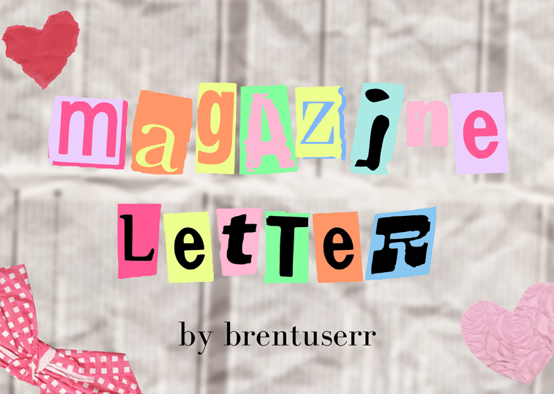
About Magazine Letter Font
I came across Magazine Letter Font while testing some bold titles for a mood-board project. I needed something loud, cut-out, and a bit chaotic, but still readable. It had to look like a ransom note and a magazine collage at the same time, without feeling cheap or gimmicky.
The quirky, mixed-style letters caught my eye first. I grabbed it for a quick layout test on Free Fonts Lab, then kept pushing it in different poster and cover mocks. I wanted to see how far I could stretch this typeface before it became too noisy or distracting in real layouts.
Font Style & Design Analysis
Magazine Letter Font is a pure display typeface, built to grab attention rather than sit quietly in a block of text. Each character looks like it was cut from a different magazine headline, so the font style feels playful, handmade, and a bit messy in a controlled way. It gives instant collage energy to any layout.
The designer is unknown, but the idea is clear and focused. The font family leans into the ransom-note, editorial mashup look that many designers try to build by hand with real paper. Here, that whole process is turned into a single ready-to-use display font, which can save a lot of layout time.
The letterforms mix different shapes, weights, and implied textures, which creates a lively rhythm line by line. Spacing is fairly tight, so the words feel dense and packed, which suits posters and covers. It is strong at large sizes but quickly becomes busy in small text. For me, its strengths are bold headlines, short phrases, and graphic, experimental typography. Long paragraphs or UI text are not its territory.
Where Can You Use Magazine Letter Font?
I would reach for Magazine Letter Font when I want loud, cut-and-paste attitude. It works well for gig posters, zines, DIY flyers, and youth-focused campaigns. It also suits editorial spreads that need one wild headline to break a clean grid. Think music events, streetwear, or creative workshops.
At large sizes, this display font shows its full character, and the mixed letters become part of the illustration. On A3 posters, magazine covers, or social media graphics, it reads clearly and feels energetic. At smaller sizes, the irregular shapes start merging, so I avoid using it for captions, body copy, or long pull quotes.
For pairing, I usually match it with a very simple sans-serif or a calm serif typeface. The supporting font handles body text and information, while Magazine Letter Font handles just the key words or short lines. I also like using lots of white space around it, because the busy letterforms already bring heavy visual weight to the layout.
Font License
The licensing for Magazine Letter Font can change, so I never assume it is free for every kind of project. Always check the original source for current terms, and confirm whether your planned use is allowed for personal, commercial, or client work.
My honest takeaway as Ayan Farabi: I use this font when a project needs controlled chaos and collage drama, but only in short, focused bursts where every word can afford to shout.


Leave a Reply