

About Manga Temple Font
I came across Manga Temple Font while searching for a bold, comic style script for a short manga-style zine. I wanted something playful, but still readable in short bursts of text. The chunky strokes and dramatic shapes caught my eye right away, so I decided to test it in that project.
I set some dialogue balloons, a loud title, and a few sound effects using this typeface. It gave the pages a strong cartoon voice without feeling too childish. For the review on Free Fonts Lab, I also tried it in posters and thumbnails to see how flexible the font style could be across different layouts.
Font Style & Design Analysis
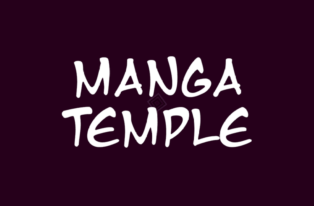
Manga Temple Font is a script font, but it leans heavily into comic and manga-inspired lettering. The strokes feel drawn with a thick marker, with angular turns and sudden curves. It looks loud, energetic, and slightly rough, which suits action scenes and expressive headings. This script category focus gives it a very informal and dynamic visual identity.
The designer is Ray Larabie from Typodermic Fonts, known for bold, expressive display and genre-inspired font families. You can feel that background here. The font is clearly built to echo classic comic book and manga title lettering, with a strong emphasis on big shapes over subtle detail. It behaves more like a display script than a text workhorse.
The letterforms use heavy weight, wide counters, and tight inner curves. Capitals are dramatic and slightly uneven, which adds energy but also reduces calmness. Spacing is fairly tight, so words form strong, dark clusters on the page. The visual rhythm works best in short phrases. It handles punchy headings, logos, and sound effects well, but long paragraphs quickly become tiring to read.
Where Can You Use Manga Temple Font?
I find Manga Temple Font best suited for loud, character-driven designs. It works nicely on comic covers, manga-inspired posters, YouTube thumbnails, and playful event graphics. At large sizes, the script shapes feel powerful and clear. Kids’ content, game art, and anime fan projects are natural homes for this kind of typography.
At medium sizes, it can carry short taglines, stickers, badges, and chapter titles. I would avoid using it for body text, subtitles, or UI labels. The heavy weight and busy letterforms reduce legibility when the size drops too low. In branding, I would keep it as a secondary display typeface rather than a main logo system, unless the brand is very niche and comic-focused.
For pairing, I usually combine this script font with a clean sans-serif that stays out of the way. A simple geometric or humanist sans helps balance the noisy energy of Manga Temple Font. Use the script for headlines and the sans-serif for body copy and captions. Leaving generous spacing and margins around the script also helps it breathe and keeps layouts from feeling cramped.
Font License
Licensing for Manga Temple Font can vary depending on the source and version. Some releases allow personal use, while commercial use may require a proper licence. I always recommend checking the current licence details from the official foundry or distributor before using it in client work or products.
My honest takeaway as Ayan Farabi: this script font is great when you need loud, comic-style energy in short bursts. I reach for it when a project needs drama and fun, but I keep it away from long reading text and serious brands.


Leave a Reply