

About Manic Font
I came across Manic Font while searching for a loose, handwritten style for a small poster series. I needed something that felt quick and human, but not childish or messy. The name caught my eye, but the shapes felt calmer than I expected, which made me curious enough to test it properly.
I first tried it on a set of social graphics for a personal project I was documenting for Free Fonts Lab. I wanted handwriting that looked casual, like notes in a sketchbook, yet still readable at a glance. The font gave me that relaxed tone without fighting the layout, so I kept exploring it in different contexts.
Font Style & Design Analysis
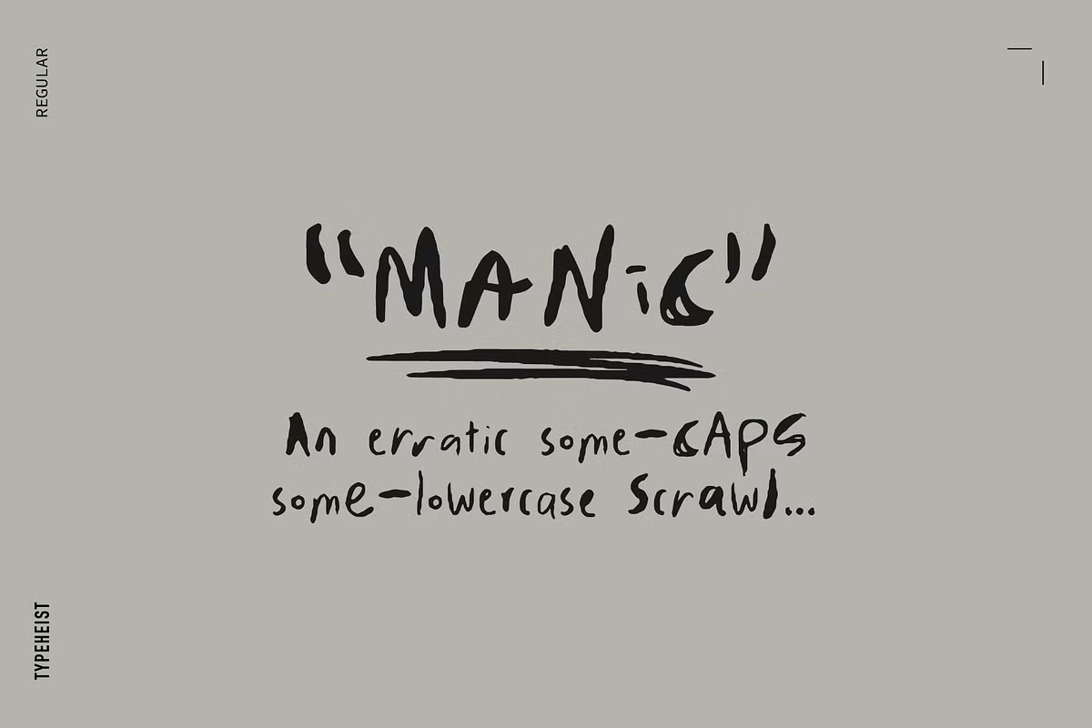
Manic Font is a handwritten typeface with a loose, free-flowing rhythm. Letters lean slightly, as if written quickly with a soft felt pen. The strokes are uneven in a natural way, so it feels like real handwriting, not a stiff digital imitation. It carries a friendly, personal mood that fits informal projects.
The designer is unknown, at least from the sources I could access. That means I could not study any wider font family or related styles from the same creator. I approached it as a standalone handwriting font, testing how stable and flexible it feels in real layouts instead of relying on any design notes or official guidance.
The letterforms have open counters and relaxed curves, which helps with legibility at medium sizes. Spacing is fairly loose, giving words a breezy feel, though it can look a bit wide in long lines of text. The rhythm works well for short phrases, headings, and notes. It struggles slightly in dense paragraphs, where the lively shapes can feel restless if you use too many lines together.
Where Can You Use Manic Font?
I found Manic Font most comfortable in titles, quotes, and short captions. It works nicely on posters, social posts, and journal-style graphics where you want a casual, handwritten touch. At larger sizes, the character of each stroke shows clearly, which strengthens the handmade feeling and adds personality to simple layouts.
At smaller sizes, the handwritten details compress, but the font remains readable for brief notes or labels. I would avoid using it for body text in long articles, because the energy of the handwriting becomes tiring over many lines. It fits best when you treat it as a highlight voice, not the main reading font.
For pairing, I had good results combining this handwritten font with a clean sans-serif for body copy. The sans-serif keeps structure and clarity, while Manic Font adds warmth in headings or side comments. It suits audiences who enjoy sketchbook aesthetics, personal brands, craft products, and any project that benefits from a friendly, informal visual identity.
Font License
The licence terms for Manic Font can vary between sources, so I do not assume full commercial rights by default. Before using it in client work, packaging, or wide distribution, always read the official licence details carefully and confirm whether both personal and commercial use are allowed.
My honest takeaway: I now reach for Manic Font when I need quick, human handwriting that stays readable and relaxed, as long as I keep it for short, focused text.


Leave a Reply