
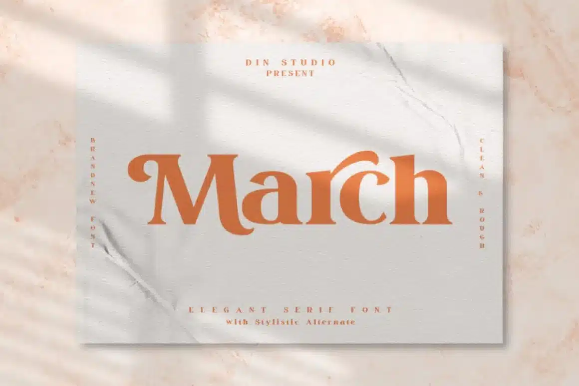

About March Font
I first picked up March Font while working on a small editorial layout for a quiet lifestyle brand. I needed a serif that felt calm but still confident, something that could carry headlines and longer text without shouting. The name caught my eye, but the shapes kept me testing it.
The more I played with this typeface, the more I saw its steady voice. It looked classic, but not dusty or too formal. I tried it in mock magazine spreads for Free Fonts Lab and a few mood boards for client pitches. It earned a place in my shortlist of go-to serif options for gentle, thoughtful projects.
Font Style & Design Analysis
March Font is a serif font, and it leans into that category with a quiet, bookish feel. The serifs are clear and fairly sharp, but they never feel harsh. The overall font style sits between traditional book typography and modern editorial design, which gives it a versatile, grounded visual identity.
The designer is unknown, at least from the sources I could check while testing it. That said, the font family feels like it was drawn with some care. The proportions suggest someone who understands reading rhythm and page layout, rather than just chasing a trendy look. It has the mood of a reading-focused typeface more than a flashy display font.
The letterforms are fairly narrow, with a slight contrast between thick and thin strokes. That contrast is noticeable but not dramatic, so it stays calm on the page. Spacing is on the tighter side, which helps headlines look neat, though long paragraphs may need a bit more line spacing. The rhythm feels steady, almost literary, which I liked for essays and calm branding. Its strength is in text and subheadings; for very tiny captions or huge posters, the details can either blur or feel a bit restrained.
Where Can You Use March Font?
In my tests, March Font worked very well in editorial and brand work where trust and softness matter. It suits magazines, journals, and blog layouts that focus on calm reading experiences. When set around 12–16 points, it holds a nice balance between clarity and character, especially with enough line spacing.
At larger sizes, like for page titles or hero headings, the serif details become more visible but still stay polite. It does not shout like a bold display face, which is a plus for brands that want a thoughtful tone. I found it pairs nicely with a clean sans-serif for captions or UI elements, creating a gentle contrast without clashing styles.
For audiences, I would reach for this serif font in lifestyle, wellness, books, education, and soft corporate fields. It fits clients who want maturity without stiffness. I would be slower to use it for loud youth brands or very playful layouts, where a more expressive typeface might do better. But for careful, text-heavy work, March Font is a steady companion.
Font License
Licensing for March Font can change depending on where you get it, so I never assume anything. Before using it in client or commercial projects, I always check the official source for the current licence, usage limits, and any required credit. For personal experiments, I still keep a record, just to stay safe.
My honest takeaway as Ayan Farabi: March Font is a calm, reliable serif that quietly supports the work instead of competing with it, which is exactly what many real projects need.


Leave a Reply