

About Maskdown Font
I came across Maskdown Font while looking for something loud but slightly rough for a gig poster. I needed a face that felt bold, a little strange, and not too polished. The shapes caught my eye right away, so I saved it for a proper test session later that day.
When I tried it inside a mock poster for a local metal show, the mood clicked fast. It had weight, impact, and a strong graphic voice. That first test led me to explore it deeper for a review on Free Fonts Lab, because I knew other designers might face the same kind of brief.
Font Style & Design Analysis
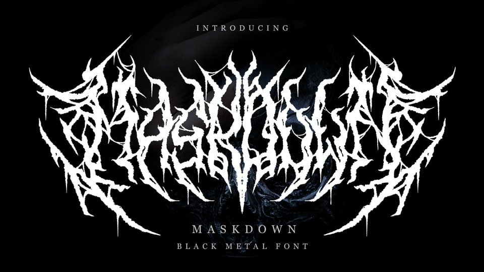
Maskdown Font is a display typeface that leans hard into bold, graphic shapes. The letters feel compact and blocky, with tight interior spaces and heavy strokes. It aims more for attitude than subtlety, and it clearly wants to sit at the top of a layout and shout.
The designer is unknown, which often happens with edgy experimental fonts that move around design communities. Even so, the font family feels intentional, not random. You can sense that someone thought carefully about how the characters line up, especially in words with repeated letters and angular combinations.
The letterforms have sharp joins and some fractured angles, which give them a slightly aggressive tone. Spacing is quite tight by default, so I often increase tracking for headlines. The rhythm works well in short words but can feel dense in long titles. It shines in bold logotypes, posters, and covers, but it is not suited to body text or long reading lines.
Where Can You Use Maskdown Font?
I see Maskdown Font working best in music posters, streetwear graphics, and bold social media covers. At large sizes, the display style feels powerful and controlled. Every cut and angle becomes a clear design element. On a dark background with high contrast colours, it adds a raw, energetic voice.
At medium sizes, such as subheadings and short pull quotes, it still holds its impact but needs careful spacing. I usually pair it with a clean sans-serif or a simple serif typeface for body copy. That contrast keeps the layout breathable while letting this display font stay the hero in the visual hierarchy.
At small sizes, the tight counters and blocky forms start to merge, so I avoid using it for captions or buttons. For branding, it can work for music labels, extreme sports, gaming channels, or any identity that leans into grit and intensity. If the audience enjoys bold, unconventional typography, this font style can build a strong visual identity.
Font License
The licence for Maskdown Font may differ between personal and commercial use, so I never assume terms. Before using it in client work or paid projects, always check the official licence details from the original source. That small step saves a lot of trouble later.
My honest take: use Maskdown when you want a heavy, gritty voice that does not feel too polished. It is not a flexible all-rounder, but when the brief matches its mood, it can anchor a layout with real strength.


Leave a Reply