
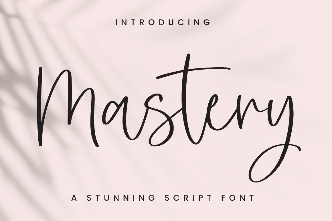

About Mastery Font
I came across Mastery Font while searching for a bold, painted look for a poster series. I needed something that felt fast, loud, and human, but still readable from a distance. The font preview caught my eye because the strokes looked rough without feeling messy.
I tested it first on a music event layout for Free Fonts Lab, then later on some social media graphics. Each time, I wanted to see if the energy held up in real use, not just in a neat mock-up. The more I pushed scale, colour, and texture, the more the font showed its character.
Font Style & Design Analysis
Mastery Font is a bold brush typeface with thick, painted strokes and strong contrast. The letters feel like they were made with a loaded marker or flat brush dragged quickly across paper. It has a raw, handmade edge, but the shapes still sit inside a clear, structured font family.
The designer is unknown, at least from the sources I could access while testing. That said, the work shows a clear understanding of display typography. The consistency across uppercase, lowercase, and alternates suggests careful planning, not just random brush marks turned into letters.
The letterforms lean slightly forward, which gives motion and urgency. Strokes end in sharp, angled cuts, adding attitude without making the text unreadable. Spacing is tight by default, so words feel compact and powerful. This helps in headlines, but long sentences can feel heavy. The brush texture works well for bold titles, logos, and short phrases, but it is less suitable for body copy or very small text.
Where Can You Use Mastery Font?
I found Mastery Font most useful in projects that needed energy and impact. It works well on posters, album covers, and sports graphics, where a loud visual identity matters. At large sizes, the brush detail and rough edges become part of the design, almost like illustration.
On smaller screens or in small text, some of the fine texture starts to blur, especially on lighter backgrounds. For mobile captions or long quotes, I paired it with a clean sans-serif typeface to keep things readable. Using this font only for key words or short headings keeps the layout balanced and avoids fatigue.
It also fits branding for streetwear, gaming, extreme sports, or any project aimed at younger, high-energy audiences. I liked it in all-caps for logos and main titles, then in mixed case for subheads. When you letterspace it slightly and give it room, the painted strokes breathe and the Mastery Font name really lives up to its bold brush style.
Font License
The licensing for Mastery Font can change depending on the source, so I never assume terms. Before using it in client work or commercial products, always review the official licence details from the original provider. For personal or experimental projects, I still double-check to confirm what is allowed.
For me, Mastery Font is a tool I reach for when I want controlled chaos in a design. It is not right for every job, but when the brief calls for raw brush energy with clear structure, it earns a place in my toolkit as a dependable, expressive display option.


Leave a Reply