
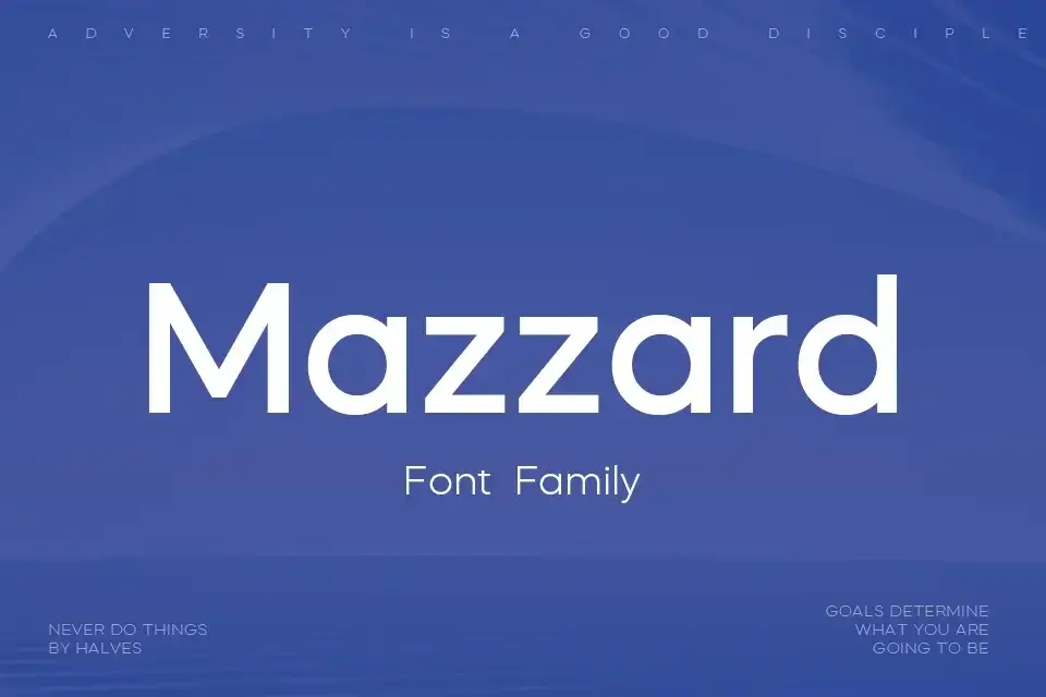

About Mazzard Font
I first tried Mazzard Font while building a clean layout for a tech case study. I needed a calm, modern typeface that did not shout, but still felt clear and sharp on screen. The name kept coming up, so I decided to give it a proper test run.
During my first session with it, I set headings, body text, and UI labels side by side. The font handled all three roles better than I expected. That balance of simplicity and character made me want to write about it here for Free Fonts Lab readers who value practical typography.
Font Style & Design Analysis
Mazzard Font is a sans-serif typeface with a very tidy and contemporary look. The shapes feel geometric, but not cold. Curves are smooth, joins are clean, and strokes stay even from start to finish. On the page, it gives a sense of order and quiet confidence without drawing attention away from the content.
The font family comes with multiple weights, which helps when building a visual hierarchy. Thinner styles work well for soft, subtle text, while the heavier cuts give structure to headings and callouts. The designer or foundry is not clearly documented, so for now I would list it as designer unknown, though the work itself feels considered and deliberate.
Looking closely at the letterforms, I see open counters, generous bowls, and terminals that stop cleanly, which keeps reading smooth on both print and screen. Spacing is even, and the rhythm stays steady at both small and medium sizes. The mood leans professional and modern rather than playful. It works strongly in neutral branding, user interfaces, and editorial layouts, but it might not suit projects that need strong personality or expressive display typography. As a sans-serif, it shines most when clarity is the main goal.
Where Can You Use Mazzard Font?
In my tests, Mazzard Font performed very well in digital products. On dashboards, forms, and navigation, it stayed legible even at tight sizes. Labels at 10–12 points remained clean, and icons with text felt balanced. For app or web UI work, it suits tech, finance, SaaS, and any product that wants a calm, trustworthy voice.
At larger sizes, such as section titles, hero copy, or slide headings, the font keeps its structure and looks steady. It does not have a flashy display personality, but that can be a strength. I have paired it with a softer serif for long articles and with a bold display face for campaign headlines, and both combinations worked because its neutrality leaves room for contrast.
For brand systems, I see it fitting corporate identities, startups, education, and clean portfolio sites. It supports layouts where information must be easy to scan and where the visual identity leans minimal. I would use it for reports, pitch decks, and style guides. For kids’ brands, fashion, or artsy posters, I might reach for something with more flavour and texture instead.
Font License
Before using Mazzard Font in client or commercial work, I always check the official licence details from the source. Terms can change over time, and personal, desktop, web, or app use may follow different rules. It is safest to read the current licence carefully and keep a copy in your project records.
My honest takeaway as Ayan Farabi: Mazzard Font is a solid, dependable choice when you need clear, modern typography that stays out of the way and lets the design system speak.


Leave a Reply