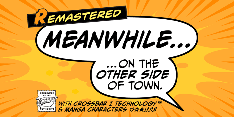
About Meanwhile Font
I came across the Meanwhile Font while searching for a loose, storybook script for a children’s campaign. I needed something friendly, a bit dreamy, but still readable in short taglines. The name caught my eye first, then the relaxed strokes made me curious enough to test it in a few layouts.
I tried it in some mock posters and social graphics for Free Fonts Lab, just to see how it behaved in real use. The font felt casual without looking messy, and it gave the designs a gentle narrative tone. That balance between playfulness and control was what made me keep exploring it.
Font Style & Design Analysis
The Meanwhile Font is a script font, and it leans towards a loose, handwritten storytelling style. The strokes feel easy and natural, almost like quick notes written with a soft marker. It does not shout or feel dramatic. Instead, it carries a calm, narrative rhythm that fits light and friendly typography.
The designer is unknown, which sometimes makes it harder to place the font in a wider design history. Still, the font family shows a clear intention. Someone wanted a relaxed script that feels human but not chaotic. You can see that care in the smooth curves, the controlled loops, and the modest contrast in stroke width.
The letterforms are rounded and open, with gentle connections that do not tangle too much. Lowercase letters sit quite comfortably next to each other, so the rhythm stays even in longer words. Spacing is on the generous side, which helps legibility at medium sizes. The mood is casual, warm, and slightly whimsical. It works well for short phrases but can feel tiring in dense paragraphs or very tiny text.
Where Can You Use Meanwhile Font?
In my tests, the Meanwhile Font worked best in headlines, short quotes, and logo concepts where character matters more than strict clarity. On posters, social media graphics, and packaging, it gives a friendly entry point to the visual identity. The script style makes it feel personal and handwritten, which many brands like today.
At larger sizes, the curves and loops really come alive. You can appreciate the flow between letters and the soft energy of the strokes. At smaller sizes, especially below body text range, the details start to merge a bit. I would avoid using it for long paragraphs or fine print, as the script structure reduces quick readability.
For pairing, I had the best results when I matched the Meanwhile Font with a clean sans-serif for body text. The contrast between a calm script font and a neutral supporting typeface keeps layouts clear. It suits children’s brands, cosy cafés, handmade product labels, and seasonal greetings. I would not use it for strict corporate or very formal projects, where a more restrained font style is safer.
Font License
The licence for the Meanwhile Font can vary depending on where you download it from. Some sources may allow personal use only, while others may include commercial rights. I always recommend checking the official licence details carefully before using it in any client or paid project.
My honest takeaway as Ayan Farabi: I reach for the Meanwhile Font when I want a gentle, handwritten script that tells a soft story without stealing the whole scene.


Leave a Reply