

About Mickey Mouse Font
I came to the Mickey Mouse Font while working on a playful kids’ event logo. The client wanted something that felt nostalgic, but not too formal or serious. I needed a typeface that could sit next to cartoon-style artwork and still hold a strong, clear title.
As I tested options for Free Fonts Lab, this one stood out because of its bold personality and strong shapes. It looked like it could carry a whole wordmark on its own. I decided to try it in a few mock logos, posters, and badges to see how the font style behaved in real layouts and different colour schemes.
Font Style & Design Analysis
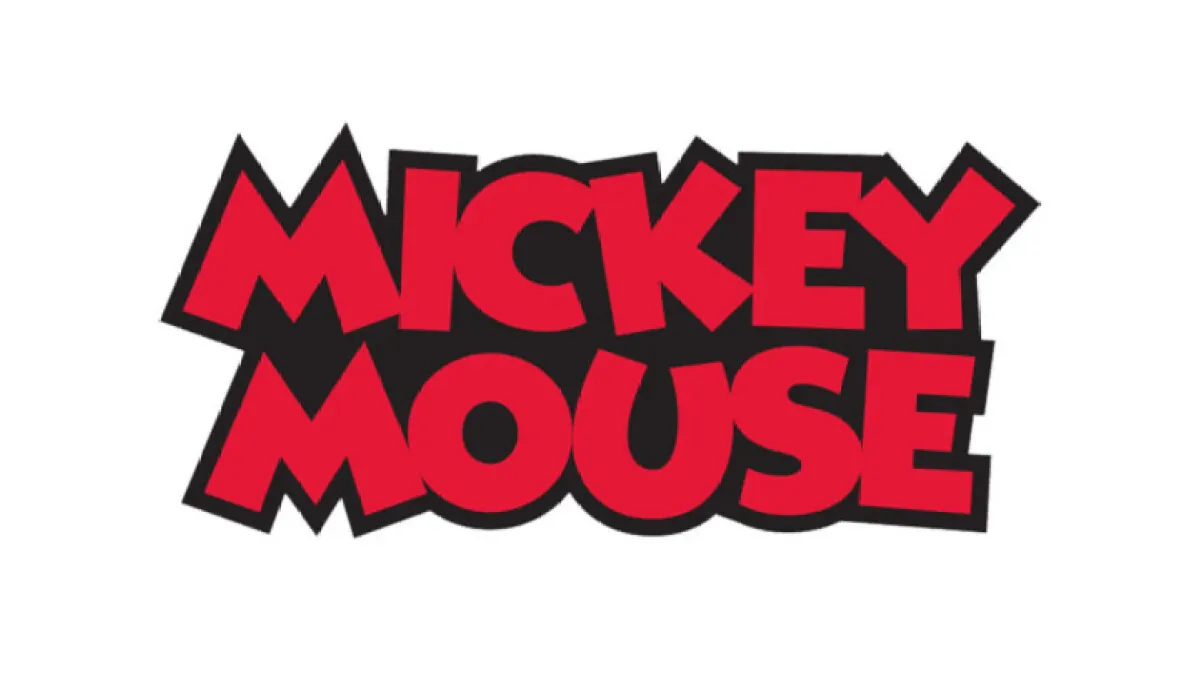
This is a pure logo font, designed to grab attention in a single word or short phrase. The typeface has chunky, rounded letterforms that echo classic cartoon branding. Strokes are thick, with soft corners and big, open counters, which give it a friendly and approachable mood. It reads more like a custom wordmark than a traditional text font family.
The original designer is designer unknown, which is common for many fan-made or themed display fonts online. Because of that, quality and refinement vary between versions you might find. Some styles feel slightly cleaner, while others lean more into a hand-drawn look. When I tested it, I looked closely at consistency from letter to letter, especially in curved shapes.
The letterforms have a bouncy rhythm, with curves that feel playful rather than strict or geometric. Spacing is fairly tight by default, so I often increased tracking a little for better clarity. The mood is light, childlike, and full of energy, which works well for headings but not for body text. Its biggest strength is character; its main limitation is low versatility beyond bold logo typography and large display use.
Where Can You Use Mickey Mouse Font?
The Mickey Mouse Font works best as a logo or main title in fun projects. I found it ideal for kids’ party branding, family event posters, birthday banners, and playful product packaging. It speaks clearly to children and parents, thanks to its soft curves and friendly weight. It instantly suggests cartoons and entertainment.
At large sizes, the typeface looks strong and confident, especially on signage, badges, and hero graphics. The bold shapes hold colour and texture very well, so it works nicely with gradients, outlines, or shadows. At smaller sizes, though, the chunky strokes can blur together, so I avoid using it for small labels, body copy, or long taglines.
When pairing it with other fonts, I usually choose a clean sans-serif for supporting text. That contrast keeps the layout readable while letting the main wordmark stay playful. Simple layouts with plenty of white space help the typography breathe. The Mickey Mouse Font is not a flexible all-rounder, but when the theme is joy, magic, or childhood, it does its job very well.
Font License
Licensing for the Mickey Mouse Font can vary between versions, so I never assume it is free for commercial work. I always check the original source for clear terms on personal and business use, and I recommend you do the same before using it in any paid project.
For me, this font is something I reach for only when a project truly needs that specific nostalgic cartoon feeling, and when used carefully, it can still add a bit of magic.


Leave a Reply