

About Molot Font
I first picked up the Molot Font while working on a game poster that needed a tough, industrial look. The client wanted something bold, almost mechanical, but still easy to read at a glance. I had seen Molot around before, but this was my first time really testing it in a full layout.
What drew me in was its heavy, compact shape and strong presence on the page. It felt like a typeface that could carry a whole visual identity by itself. I tried it in different colour schemes and textures, and it responded well each time. For Free Fonts Lab, I wanted to explore how far this font family can go beyond just loud headlines.
Font Style & Design Analysis
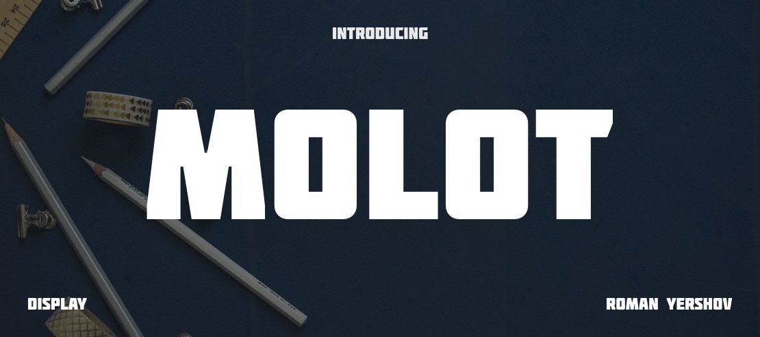
Molot Font is a pure display typeface, built for impact rather than long reading. Its forms are blocky, dense, and slightly squared, which gives it a heavy, industrial mood. The letters sit tightly together, creating a solid, almost concrete line of text. It immediately suggests strength, power, and a slightly retro constructivist vibe.
The font is widely shared online with the note “designer unknown”, and that still seems accurate from what I can find. That anonymity adds a curious edge, because the design itself is quite memorable. Even without a famous foundry attached, it has the confidence of a professionally planned font style rather than a casual experiment.
The letterforms use straight strokes with minimal curves, which creates a stiff, engineered rhythm. The uppercase set works best; the compact width lets you fit strong words into small spaces. Spacing is tight but mostly consistent, though I sometimes adjust tracking for cleaner typography. It shines in bold slogans, logos, and short titles, but it quickly becomes tiring in long lines or small sizes. As a display font, its main strength is loud, focused messaging, not subtle nuance.
Where Can You Use Molot Font?
I reach for Molot Font when a project needs heavy impact and a slightly rugged tone. It works well for game covers, sports branding, music posters, and tech events that want a strong, mechanical edge. On large billboards or hero banners, it reads clearly and keeps its character, especially in uppercase.
In small sizes, the dense shapes and tight spacing start to blur, so I avoid using it for body copy or detailed captions. It performs best as a headline layer with a calmer companion typeface for longer text. I often pair it with a clean sans-serif for contrast, which helps balance the loud energy of the display forms.
For audiences, it speaks well to younger, energetic groups: gamers, streetwear fans, or anyone into bold graphic design. It can also work in branding that leans into industrial, military, or constructivist aesthetics. With the right layout and colour blocking, this font family can anchor a full visual identity system, as long as you keep its use focused and controlled.
Font License
Licensing for Molot Font can vary between sources, so I never assume anything. Before using it in client or commercial work, I always check the current licence terms from the official distributor. Treat it as free to test, but confirm rights for print, web, and logo use each time.
My takeaway as Ayan Farabi: Molot is not a quiet or flexible tool, but when a project needs loud, blocky strength, it does that job very well.


Leave a Reply