

About Monaspace Font
I first reached for Monaspace Font while testing type options for a clean, code-focused layout. I wanted something that felt technical, but still human and warm. The font kept appearing in conversations among designers, so I finally gave it a proper trial in a real interface mock-up.
The more I used it, the more the character of the typeface stood out. Its shapes felt thoughtful rather than flashy. I brought it into a few experiments for Free Fonts Lab, then into a personal dashboard project. Those tests helped me see how this font family behaves in different settings, especially when pushed beyond simple code snippets.
Font Style & Design Analysis
Monaspace Font is a display typeface, but it borrows the clear structure we expect from coding fonts. The letters sit with calm, steady rhythm, so blocks of text look stable and ordered. At larger sizes, the quirky details in the curves and terminals become more visible and give the typography a soft, crafted feel.
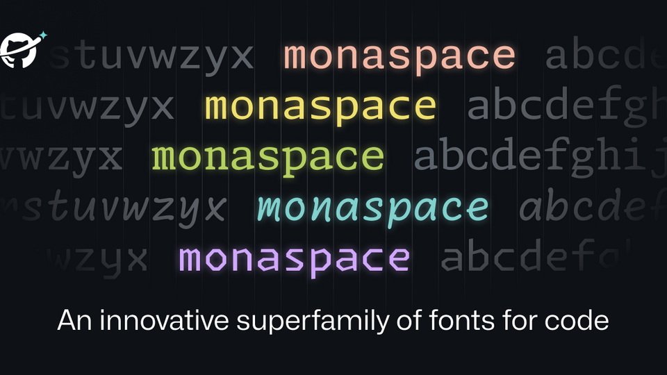
The font family was released by GitHub, with design work led by Kara Gordon and collaborators. That background explains many of its choices. It feels engineered for clarity, yet shaped with a designer’s eye. You can see that mix of utility and personality in how each weight stays consistent from style to style.
The letterforms have generous counters, open apertures, and a clear pixel-friendly skeleton. Spacing is moderate, so lines breathe without drifting apart. In headings, the font style delivers a confident, technical mood, but it never looks cold. Small text remains readable, though this display design shines most when you let letters stretch a bit. Its main limitation appears in very dense body copy, where the strict structure can feel slightly rigid over long reads.
Where Can You Use Monaspace Font?
I found Monaspace Font most comfortable in digital work where clarity really matters. It suits dashboards, developer tools, code-themed branding, and tech landing pages. At large sizes in hero text, the font style gives interfaces a modern, organised look. It speaks well to audiences who value structure, focus, and clean layouts.
At smaller sizes, it still holds up in UI labels, buttons, and menus. The open shapes keep things legible on screens with different resolutions. For longer articles, I prefer pairing it with a softer serif or sans-serif body typeface. Using Monaspace for headings and key callouts, while another font handles paragraphs, creates a strong visual identity without tiring the eye.
Print use is possible, but I see it mainly as a digital-first display choice. It works nicely on posters, stickers, or conference badges linked to code, data, or engineering themes. When pairing, I like simple geometric sans-serif fonts, as they echo its order without copying it. Careful spacing and generous margins help the letterforms breathe and show their subtle character.
Font License
The licensing for Monaspace Font can change over time, and usage terms may differ for personal and commercial projects. Before you use it in client work or products, always read the latest licence details from the official source and confirm that your planned use is allowed.
For me, Monaspace has become a quiet, dependable option when I need something structured yet human. It will not fit every brand, but when the mood is focused, technical, and honest, it earns its place in my toolkit.


Leave a Reply