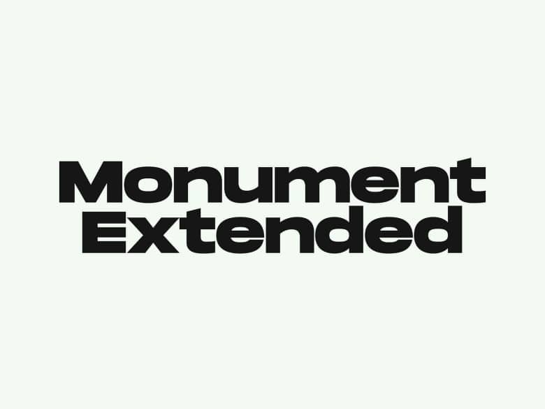
About Monument Font
I first reached for Monument Font while working on a bold poster series that needed clear, strong type. The layout had heavy shapes and flat colour, so the letters had to hold their own without feeling messy or loud. This font seemed like it could carry that weight.
The name suggested something solid and grounded, which matched the tone of the project. I wanted a sans-serif that felt modern but not cold, with enough personality to stand out in a simple grid. I tested it across a few mock-ups for Free Fonts Lab and kept coming back to how steady and controlled it looked on the page.
Font Style & Design Analysis
Monument Font is a sans-serif typeface with a firm, architectural presence. Its shapes feel carved rather than drawn, with straight lines and tight curves that give a strong, almost structural look. The proportions lean slightly wide, so words sit confidently on a line and create a stable, grounded block of text.
The designer is unknown, but the decisions behind this font feel quite deliberate. The styling suggests someone who looked closely at contemporary display sans-serif trends and then stripped them down to the basics. Nothing feels playful or loose. Instead, the font family focuses on clarity, weight, and clear geometry, which keeps it dependable in layout.
The letterforms have clean strokes, minimal contrast, and a steady rhythm from character to character. Spacing is on the tighter side, which works well for headlines and big titles but can feel dense in longer paragraphs. The mood leans serious, confident, and urban. Its strengths show in bold statements, logos, and short lines, while extended body copy exposes its stiffness and reduced reading comfort.
Where Can You Use Monument Font?
I find Monument Font works best as a display sans-serif for strong, short messages. It fits well in posters, album covers, event graphics, and social media visuals where the text acts almost like a graphic shape. At large sizes, the geometry feels sharp and deliberate, and the edges read very clearly.
In smaller sizes, the same firmness can become a bit heavy, especially in longer sentences. I would not use it for full articles or small captions, but it can handle subheadings and short UI labels if spacing is opened up slightly. On screens, the font style keeps its clarity, though it does benefit from generous line height.
For pairing, I usually match this font with a softer serif or a humanist sans-serif that can handle body text. That contrast lets Monument Font carry the visual identity in headlines while the partner font takes care of comfort and reading flow. It suits brands that want a modern, assertive tone: tech, architecture, galleries, streetwear, or music-related projects.
Font License
The licence terms for Monument Font can vary depending on the source, especially for commercial work. I always check the official licence details before using it in paid client projects or large distributions. For any professional use, it is safest to review the current terms carefully and keep a record of the permission.
For me, this typeface is a solid choice when I need something blunt, stable, and graphic, as long as I keep it away from long reading passages.


Leave a Reply