

About Morganite Font
I came across Morganite Font while building a bold poster system for a tech event. I needed something tall, sharp, and modern, but still easy to read from a distance. Many options felt either too decorative or too plain, so I decided to test this typeface properly.
What kept me interested was its narrow shape and strong vertical feel. It promised big impact without stealing attention from the layout itself. I tried it across headlines, banners, and simple social graphics. For designers who follow my notes on Free Fonts Lab, this font quickly became an interesting study in condensed sans-serif design.
Font Style & Design Analysis
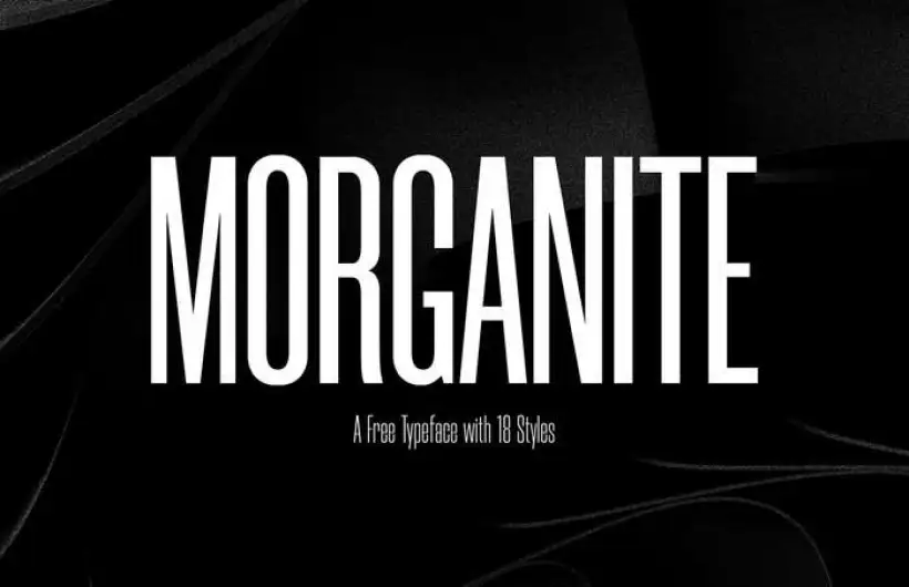
Morganite Font is a sans-serif typeface with a clear, condensed look. Its tall structure and tight widths make it feel direct and efficient. The strokes stay quite even, with almost no contrast, which gives it a clean, industrial mood. It looks like it wants to save horizontal space while still shouting the message.
The designer is not clearly credited in the sources I checked, so I would list it as designer unknown. From my experience, the font family seems to include several weights, moving from light to bold. That range makes it more flexible than many narrow display fonts, especially when planning a full visual system.
The letterforms use straight lines and simple curves, with very open counters in letters like O, C, and D. Spacing is tight by default, but the rhythm stays stable, so words feel like strong blocks of type. This sans-serif font works best for short text, headlines, and numbers. Long paragraphs feel a bit tense, and tight tracking can quickly hurt legibility on small screens.
Where Can You Use Morganite Font?
I found Morganite Font most effective in large sizes. Event posters, tall banners, and web hero headlines are good homes for this font style. Its condensed build lets you fit long titles into narrow spaces, like mobile headers or vertical layouts. It also works well for bold pull quotes when you want a strong graphic feel.
For branding, I would use it in industries that like a sharp, urban, or tech-forward visual identity. Think fashion streetwear, music events, gyms, or product launches. On its own as a logo, it can feel a bit generic, but in a full system with colour, imagery, and grid, it holds the tone very well.
When I pair it, I often combine this sans-serif headline font with a softer serif or a neutral grotesk for body text. It helps balance the tight, tall rhythm of the letters. For small captions or long paragraphs, I avoid it, as the condensed forms reduce legibility. Use it as a lead voice, not the only voice in the layout.
Font License
Before using Morganite Font in any project, especially client or commercial work, always review the official licence terms. Some sources allow personal use only, while others may permit broader usage. I strongly recommend checking the original font provider to confirm rights, restrictions, and any attribution needs.
My honest takeaway as Ayan Farabi: I reach for Morganite when I need compact, confident headlines, but I keep it away from long reading text.


Leave a Reply