

About Moulin Rouge Font
I came across the Moulin Rouge Font while searching for a bold title style for a vintage poster concept. I wanted something loud, theatrical, and a bit dramatic, but not cheesy. The name caught my eye first, but the shapes kept my attention for much longer.
I tested it in a mock theatre poster and a social media graphic for a music event. In both cases, the font helped set a strong stage feel very quickly. I later wrote notes about it for Free Fonts Lab, because I felt many designers might reach for it when they need instant showtime energy.
Font Style & Design Analysis
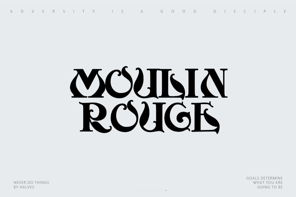
This is a pure display typeface, built for large sizes and bold statements. The letters feel theatrical, almost like signage outside an old cabaret or cinema. There is a clear sense of drama in the forms, with strong vertical strokes and decorative touches that draw the eye to each word.
The exact creator of this font is designer unknown, at least from what I could confirm through usual font sources. Without clear authorship, I treat it more cautiously in client work. Still, the design shows a focused idea, which suggests it was made with show posters and event branding in mind.
The letterforms have heavy strokes, tight counters, and a compact rhythm, which gives text a dense, powerful block of colour. Spacing leans on the tight side, especially in uppercase, so I often add tracking when setting wide titles. The mood is bold, festive, and slightly retro. It shines in headlines, but quickly loses clarity in small text or long paragraphs, which is expected from a display font family.
Where Can You Use Moulin Rouge Font?
In my tests, this font worked best in large, centre-stage roles. Think event posters, concert promotions, theatre banners, or bold cover graphics. At big sizes, each character has room to show its dramatic shape. The more space you give it, the more confident and focused the typography feels.
For branding, I would only use the Moulin Rouge Font in industries where show and spectacle make sense. Entertainment, nightlife, festivals, cabaret-inspired restaurants, or themed bars could all use it for logos or signage. For more serious or corporate brands, it feels too theatrical and might clash with the intended visual identity.
On layouts, I like pairing this typeface with a clean sans-serif or a quiet serif for body copy. The strong display style sets the tone in headings, while the supporting font keeps reading smooth. I avoid setting long lines in this font, even in all caps, because the dense forms can tire the eye very quickly.
Font License
The licensing for the Moulin Rouge Font can vary, and details are not always clear from every source. I always check the original provider to confirm if use is allowed for personal projects, client work, or commercial products. When in doubt, I treat it as restricted until I read a clear licence.
My honest takeaway as Ayan Farabi: this font is a strong, theatrical tool that works well when you really need attention and atmosphere, but it needs careful sizing, pairing, and licence checking before it joins any serious design system.


Leave a Reply