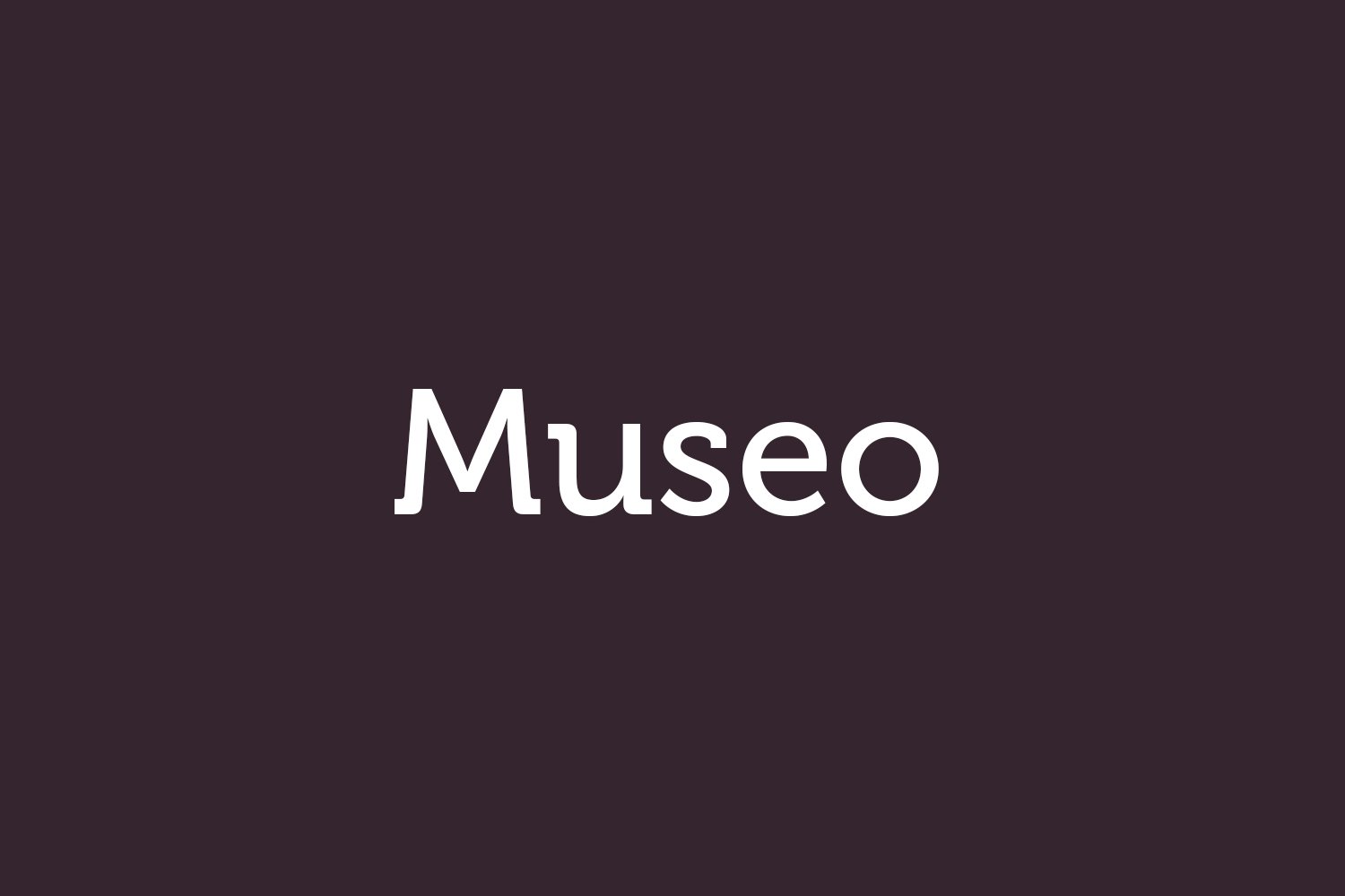
About Museo Font
I first reached for Museo Font while working on a museum-style brochure that needed calm, serious typography without feeling stiff. I wanted something modern, but still rooted in classic book design. The name caught my eye, but the shapes kept me interested long enough to test it in real layouts.
As I tried different pages and headings, the font felt steady and balanced. It did not shout for attention, yet it held the grid very well. I later wrote about these tests for Free Fonts Lab, because the experience showed me how this typeface behaves in real design work, not just in sample posters.
Font Style & Design Analysis
Museo Font is a serif typeface with a clear, geometric sense of order. The strokes feel measured and tidy, but there is still a gentle warmth in the curves. The large, open counters give the font family a clean, airy look, which helps it read well on screen and in print layouts.
The typeface was designed by Jos Buivenga at the foundry Exljbris, and that design background shows. His work often balances display charm with everyday function, and Museo fits that line very closely. It sits between expressive and practical, which makes it easier to place in different visual identity systems.
The letterforms have sturdy vertical stems and slightly quirky terminals that add character without turning playful. Spacing feels even in text blocks, though the rhythm leans a bit tight at small sizes. The mood is calm, modern, and a bit intellectual. It works well for structured layouts, but is less suited to very casual or handwritten-style themes.
Where Can You Use Museo Font?
I found Museo Font most comfortable in editorial work, brand guidelines, and cultural projects. It suits museums, galleries, architecture studios, and educational materials that need a serious, confident serif voice. At larger sizes, like section titles or pull quotes, its distinct details add personality without stealing focus from images.
In smaller body text, the serif structure still holds up, but you need careful line spacing. On screens, I prefer it for short articles, captions, and UI headings rather than very long reading experiences. Pairing it with a simple sans-serif, such as a neutral grotesque, helps create a clear hierarchy between headings and supporting copy.
For brand identities, this serif font style fits clients who want to feel knowledgeable and accessible at the same time. It can support logos with strong geometric marks, as the tidy letterforms echo clean shapes. I avoid using it in very playful children’s work or ultra-minimal tech brands, where its personality might feel slightly too human and decorative.
Font License
The licensing for Museo Font can vary between personal and commercial use, depending on the source and specific style you choose. I always check the official licence terms before using it in any paid client project, especially for logos or large-scale campaigns, to stay safe and compliant.
After many tests, I see Museo as a reliable, characterful serif that works best when you give it space and clear structure.


Leave a Reply