

About Nectarine Font
I first tested Nectarine Font while working on a bright summer drink poster. I needed a bold, fun title that felt fresh but not childish. When I saw its chunky curves and playful energy, it matched the mood I had in mind. It looked like something you could almost taste.
That first test led me to explore it more deeply for Free Fonts Lab. I wanted to see if this typeface could handle real layout work, not just a quick headline mockup. The bold shapes looked promising, so I used it across a few different design drafts to see where it really shines and where it starts to struggle.
Font Style & Design Analysis
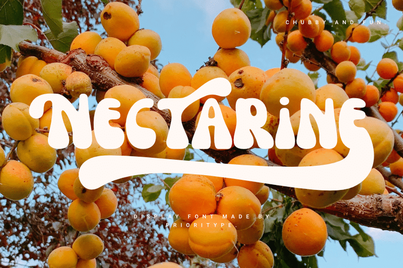
Nectarine Font is a pure display typeface, built for attention and impact. The letterforms are wide, rounded, and confident, with soft corners that give a friendly tone. It feels lively on the page, almost like a handwritten sign, but with more control and structure. The visual weight leans heavy, so it grabs the eye very quickly.
The designer is unknown, at least from the sources I could check. That said, the design choices feel intentional rather than random. The font family looks like it was shaped with poster work in mind. You can sense a focus on fun, food, and lifestyle themes, rather than corporate branding or serious editorial layouts.
The letters have generous counters and big, open shapes, which help readability at medium to large sizes. Spacing is fairly tight by default, so I often increase tracking slightly for wordy headlines. The rhythm feels bouncy, not formal, which suits casual branding. It struggles in long paragraphs, though, because the strong shapes become visually heavy. As a display font, it works best when used in short bursts: titles, logos, and short phrases.
Where Can You Use Nectarine Font?
I see Nectarine Font fitting well in food packaging, café menus, kid-friendly posters, and summer event branding. It has that juicy, informal mood that works nicely for ice cream, drinks, and lifestyle products. When I used it on a lemonade poster, the vibe felt sunny and approachable without looking cheap or gimmicky.
At large sizes, the curves and weight really come alive. Headlines, hero text, and logo marks benefit most from this font style. At smaller sizes, especially in body text, the heavy forms start to blur together. I avoid using it below medium display sizes, because the counters lose their clarity and the word shapes feel cramped.
For pairing, I usually match Nectarine Font with a clean sans-serif for body copy. A simple, neutral typeface keeps the layout balanced and stops the design from feeling too loud. It also helps the display letters stay the clear hero. I would use it for playful brands targeting families, teens, or creative small businesses that want warm, friendly typography.
Font License
The licence terms for Nectarine Font can vary, and I would not assume full commercial rights by default. If you plan to use it for client work, products, or branding, always review the official licence from the original source. For personal or experimental projects, still double-check the allowed usage first.
My main takeaway as Ayan Farabi: this font works beautifully when you treat it as a bold flavour, not the whole meal. Use it with care, give it space, and it will reward you with strong, playful character.


Leave a Reply